Project Highlights
- The 17-floor workplace draws inspiration from the city itself, reflecting the bank’s history in Chicago while looking towards its future
- Floorplates support specialized team structures and a variety of space types for agile working
- Chicago's iconic bridges inspire custom carved acoustic wall panels and graphics
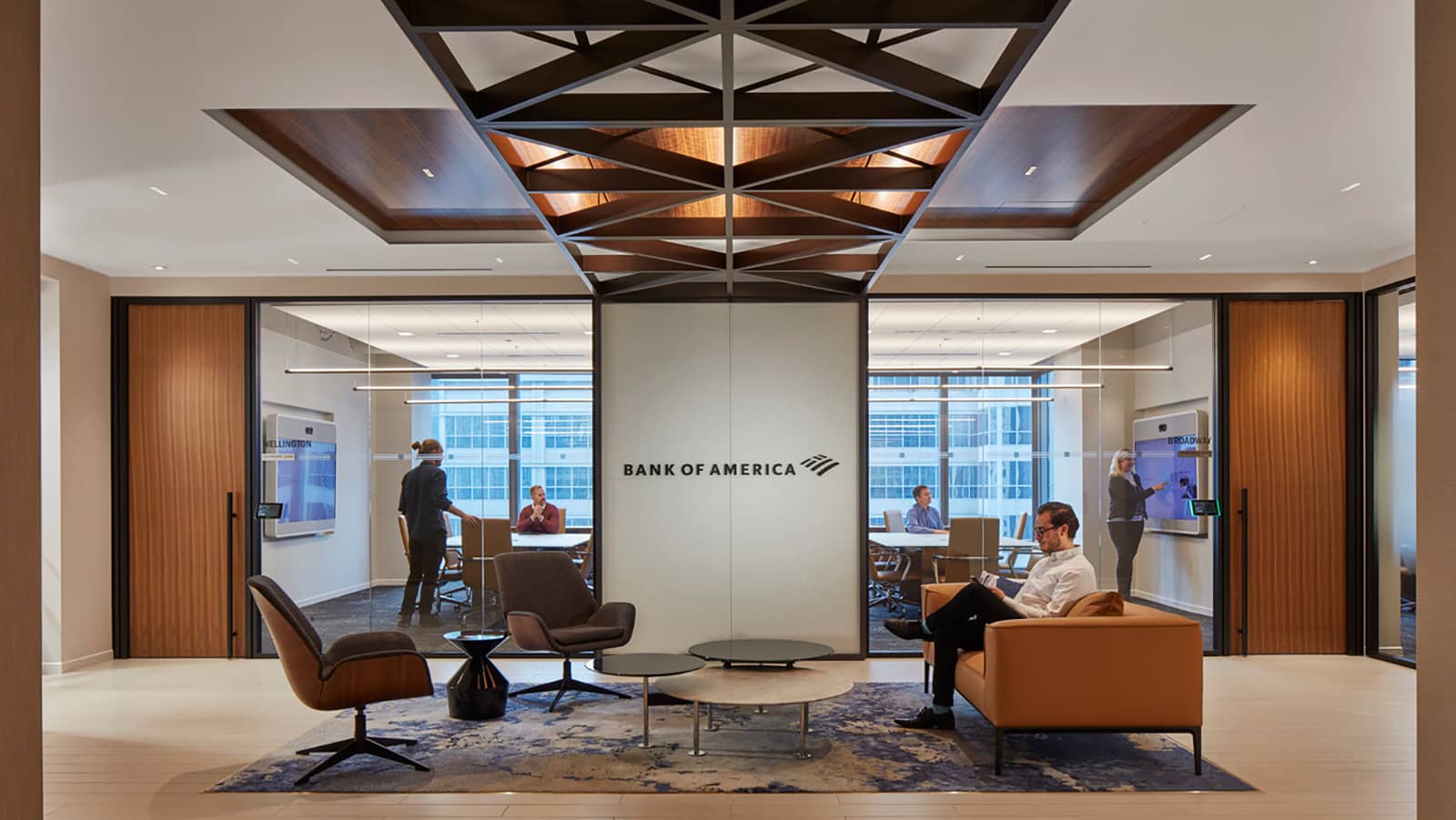
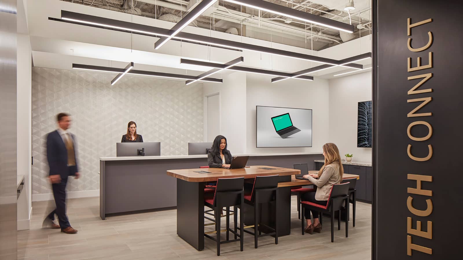
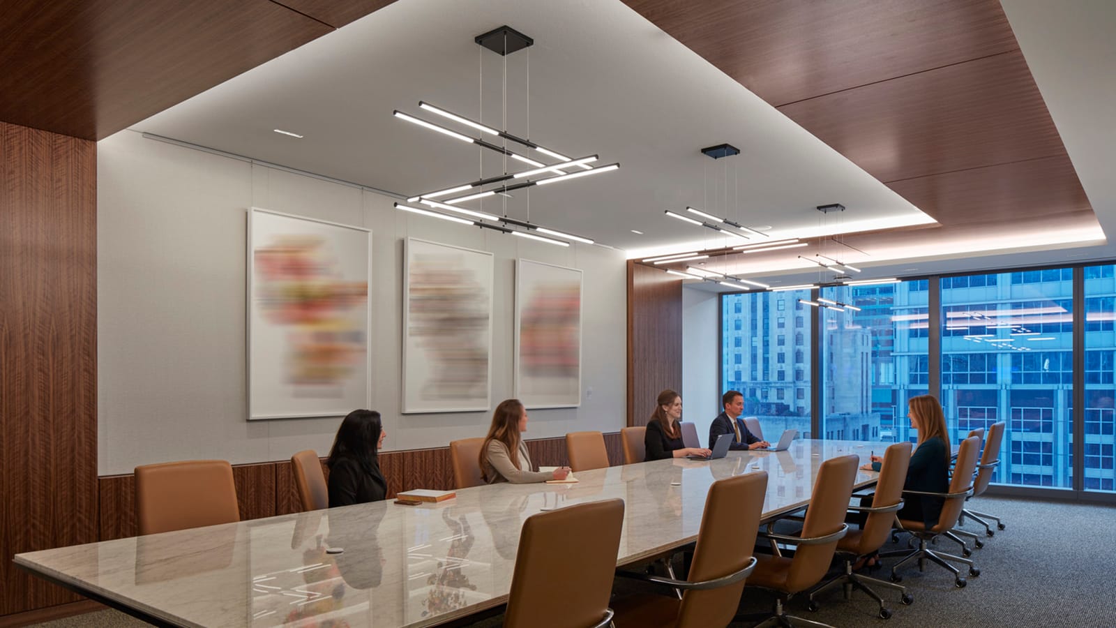
- Typical floors feature a reception area, client-facing conference rooms, and pantry or work café anterior to the secured work zone
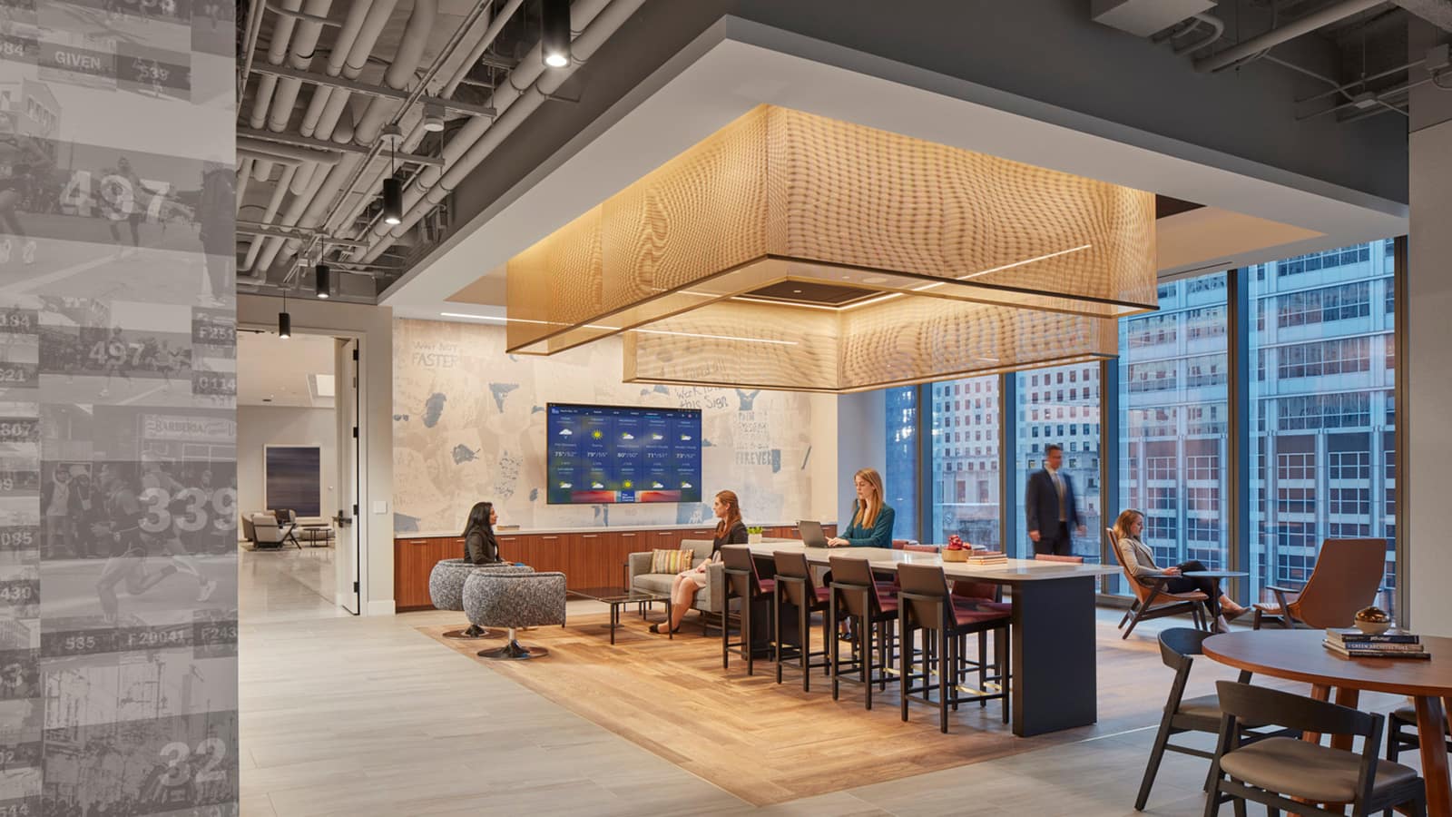
- Large work cafés encourage collaboration and social interaction
- Trading floor with adjacent training area and client entertainment zone that spills onto a rooftop terrace
- Conference center with client-facing meeting rooms complemented by a series of internal training rooms with retractable walls
- A variety of experiences and features highlighting the bank’s history, culture, and interaction with the community
*Note: all collaboration and social spaces are utilized per local health guidelines and when Bank of America’s employees and clients feel it’s safe to do so
Summary
The design of Bank of America’s new offices in Chicago exemplifies the portfolio-wide evolution of the look and feel of its corporate workspaces to a more dynamic and inclusive environment. This new space is part of a strategy to bring teams together to collaborate and best service clients, as well as reflect the bank’s history in Chicago while looking towards its future. Urban, modern, and timelessly elegant, with unexpected signature moments that inform and inspire, defines the new workspace.
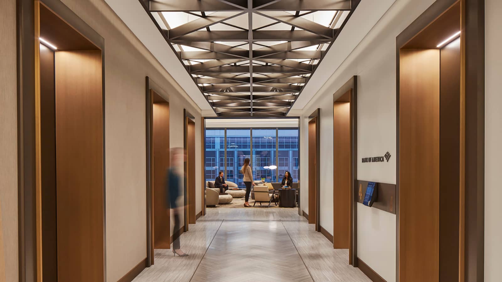
Throughout the 17-floors, IA’s design and Experiential Graphic Design (EGD) teams incorporated a series of experiences and features that underscore the bank’s history, culture, and interaction with the community. Art-deco-style tiles and other design elements reference its previous Lasalle Street Historic District location. Chicago's iconic bridges inspire custom carved acoustic wall panels and wallcovering designs. At every elevator lobby a custom trellis, based on a series of bridge trusses, becomes a layer of geometrical-inspired perforated ceiling panels that create a lively play of shadow and pattern. Overall, the design balances raw materials (exposed ceilings, black metal, stone) with warm wood tones, textured upholsteries, and a sophisticated neutral palette with pops of energetic color and pattern.
Acquired in 2008, the Bank of America Chicago Marathon is one of the six World Marathon Majors. In 2019, 45,000 participants from around the world ran through 29 of the city’s neighborhoods, celebrating personal achievement, boosting multiple sectors of the local economy, including retail, hospitality, and entertainment, and bringing the city together while raising money for charities. An experiential design narrative vertically ascends through the tower and traces the runners’ path through the neighborhoods, expressed as an abstract map of each neighborhood at the communal pantry on each floor. Near collaboration areas, an IA-designed mosaic wall installation subtly highlights neighborhood details via custom illustrations using color, texture, and words.
While several spaces were designed to promote collaboration and client engagement, they are currently utilized per local health guidelines and when Bank of America’s employees and clients feel it’s safe to do so. Each line of business has its own locality, although there are numerous spaces throughout that promote collaboration. For meetings and dining, each team can bring clients to any typical floor, where the reception area, client-facing conference rooms, and pantry or work café are anterior to the secured work zone. At every third floor a larger work café further encourages social interaction. On the 26th floor which houses the trading floor, the design also includes a training area and client entertainment zone that spills onto a rooftop terrace.
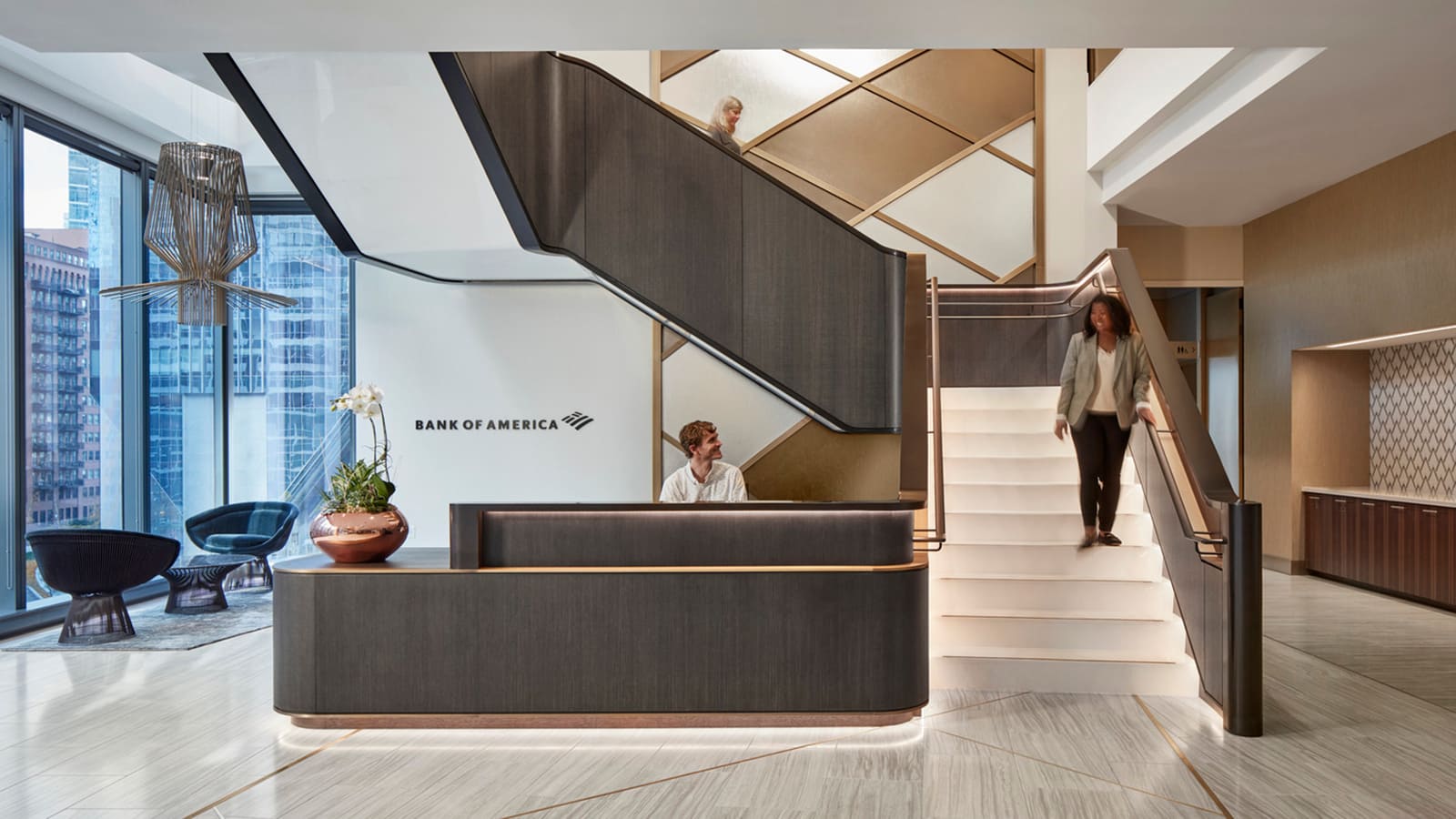
In addition, both associates and clients may utilize the fourth-floor conference center. A series of client-facing meeting rooms along the southwest corridor, flooded with natural light and overlooking the Chicago River, complements a series of internal training rooms, with retractable walls, along the southeast corridor. From the stunning two-story reception, a connecting stair leads to extended conferencing and a client entertainment zone on the fifth floor. Abstractly referencing the Bank of America Flagscape logo, a two-story trellis ribbon wraps the entire reception area. Starting as metal insets in the stone floor it becomes a vertical trellis of clear and bronze-colored glass that folds horizontally into a series of suspended acoustic ceiling panels with integrated lighting.
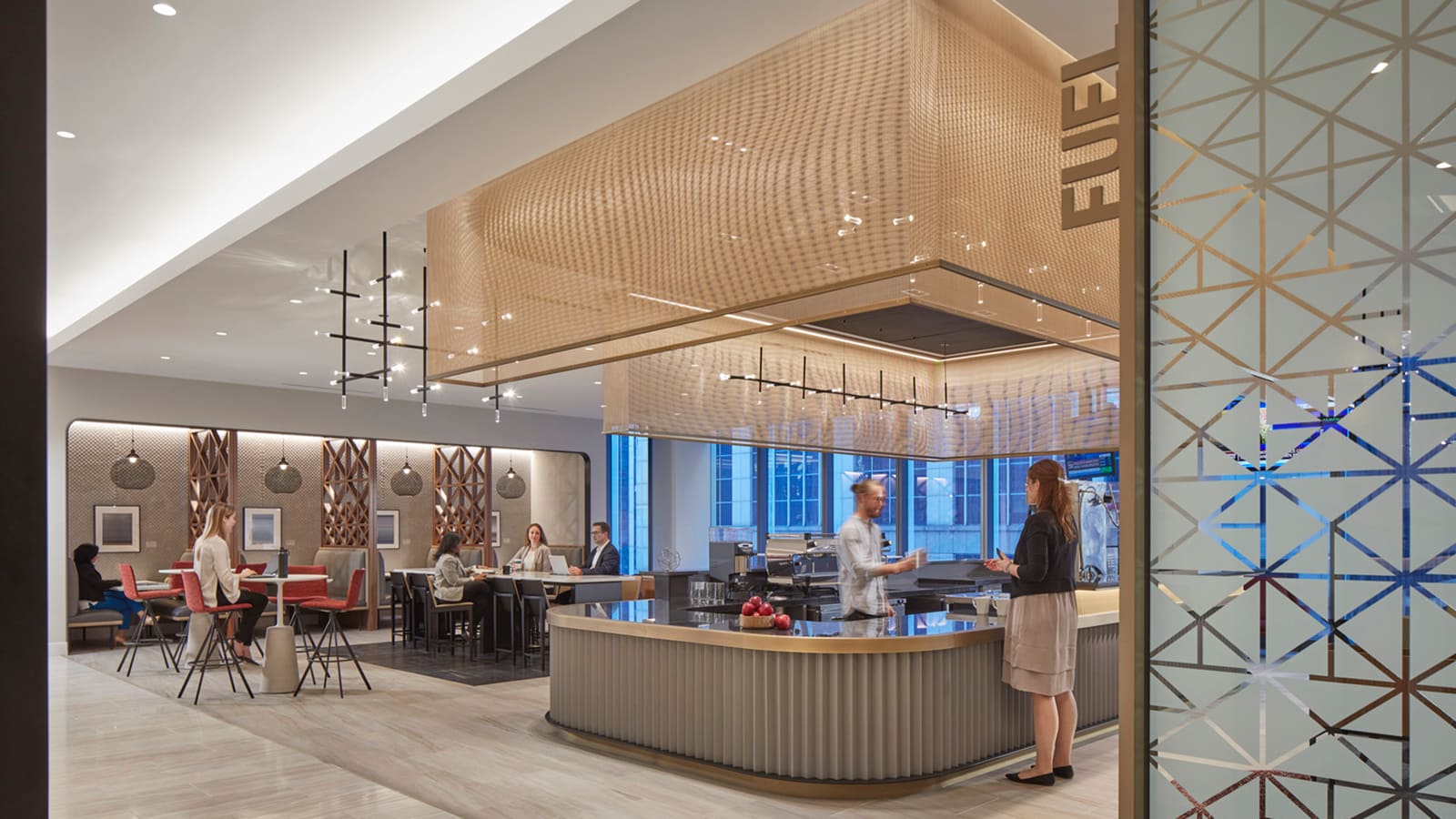
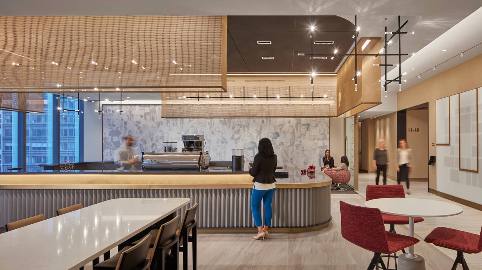
Across from the fourth-floor reception, clients and associates can meet, work, or relax with a cup of coffee at a barista lounge aptly named FUEL. There, a large-scale tonal image depicts marathon runners kicking off the 26.2 mile journey. Overlooking the Chicago River and connecting bridges, an adjacent market café with a generous terrace displays a collage of marathon photographs featuring a textured graphic of stylized bibs, which recalls the mix of participants who join together for the event. A nearby sculpture of crushed cups is an IA design cast in bronze that alludes to the need to stay hydrated for peak performance, as well as to the many volunteers who support the event and the sustainability story (cups are collected after the race and composted for neighborhood community gardens).
Striking a balance between consistency and customization, floor plates support specialized team structures and a variety of space types for agile working, but will accommodate smart space changes in the future and efficient moves.
