Project Highlights
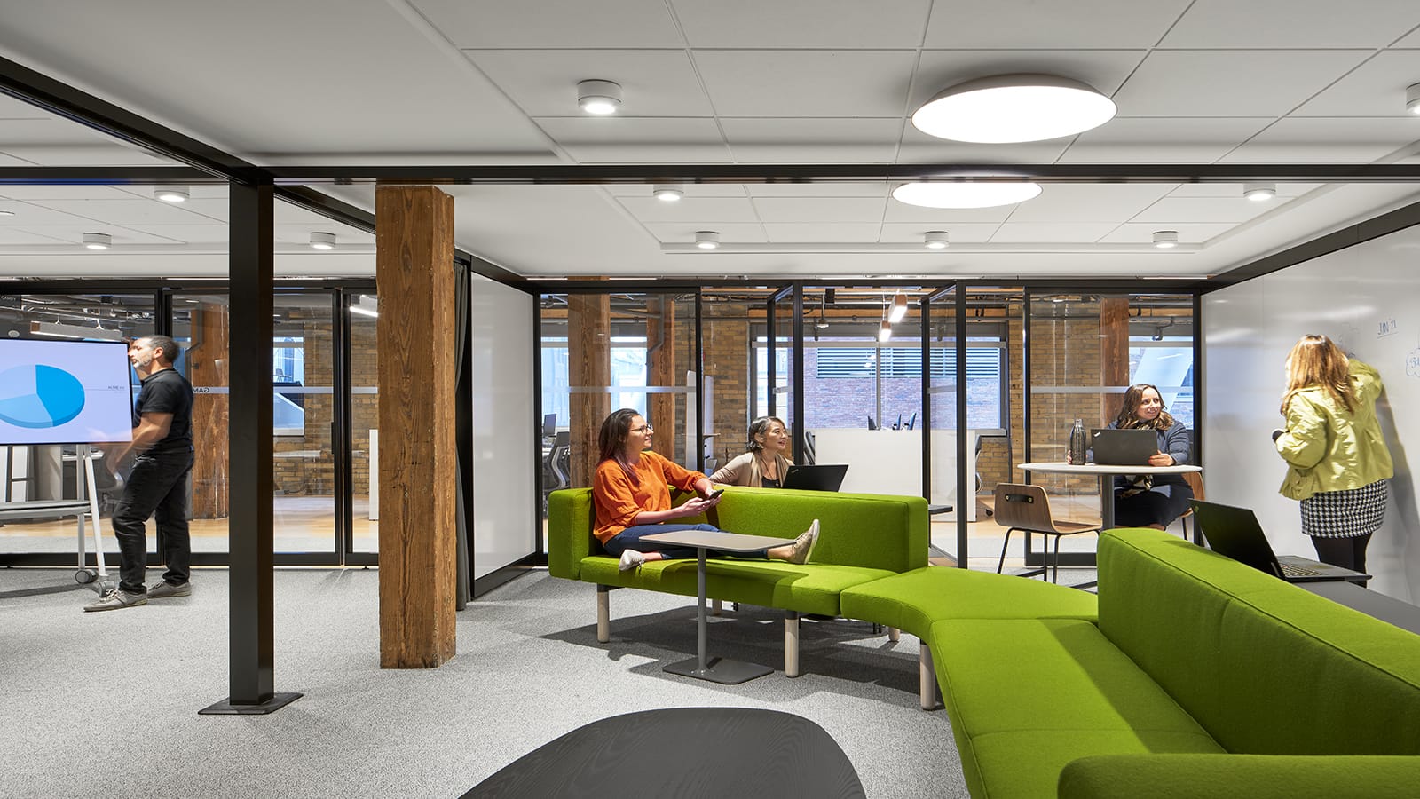
- Activity-based work setting with unassigned seating and writeable surfaces promotes collaborative, agile, and mobile work to further foster innovation and talent for this national food retailer
- Attention to the user experience guided all decisions creating a beautiful, comfortable, and practical workplace
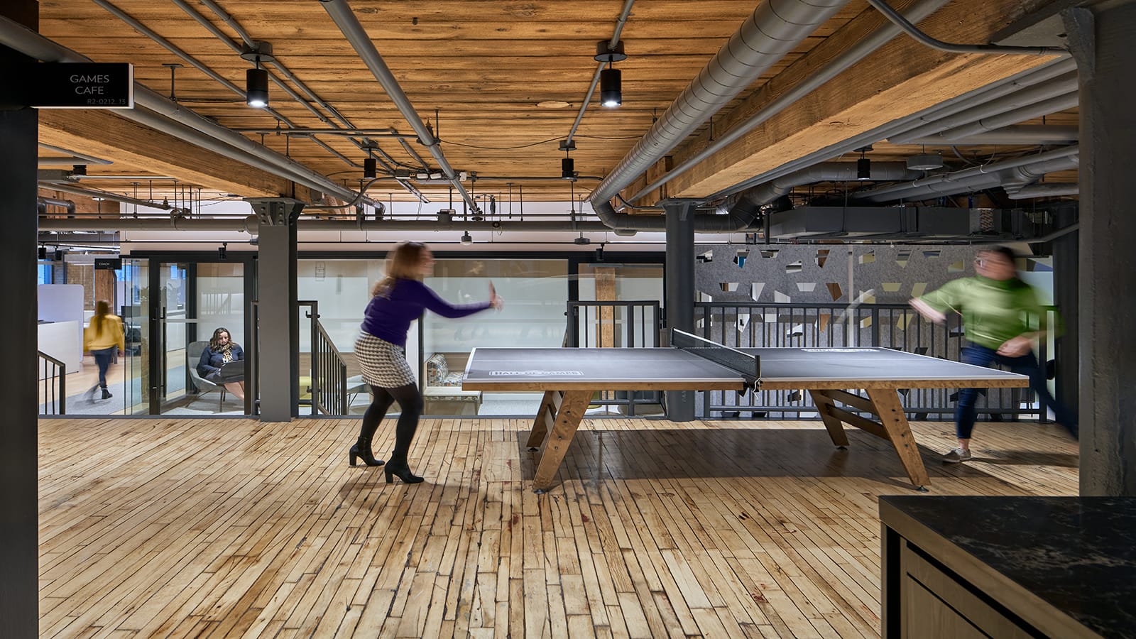
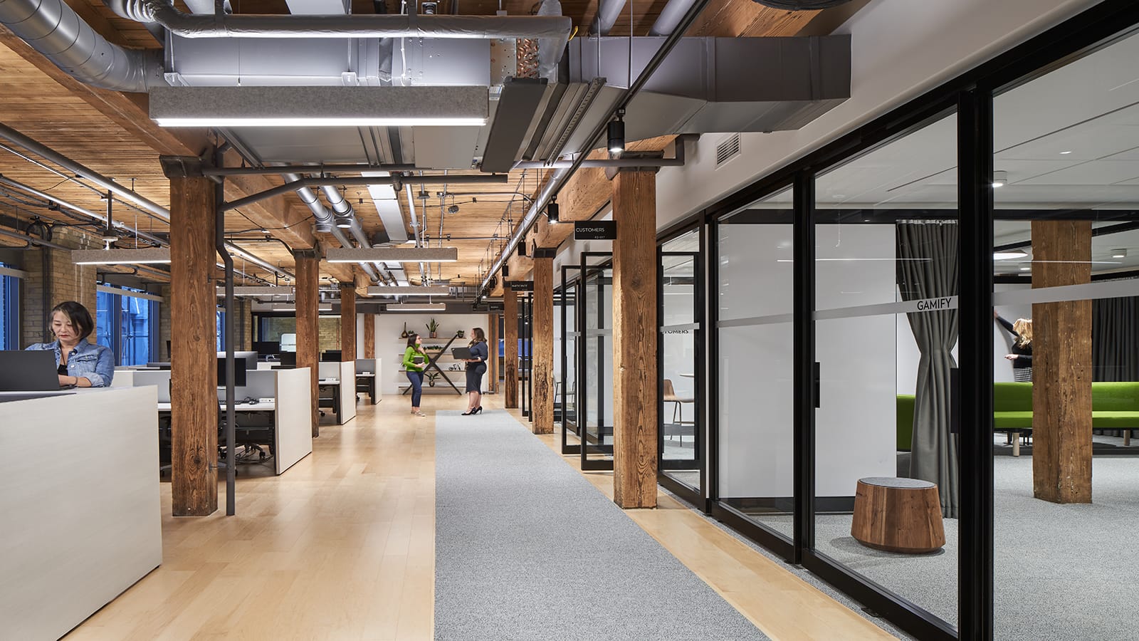
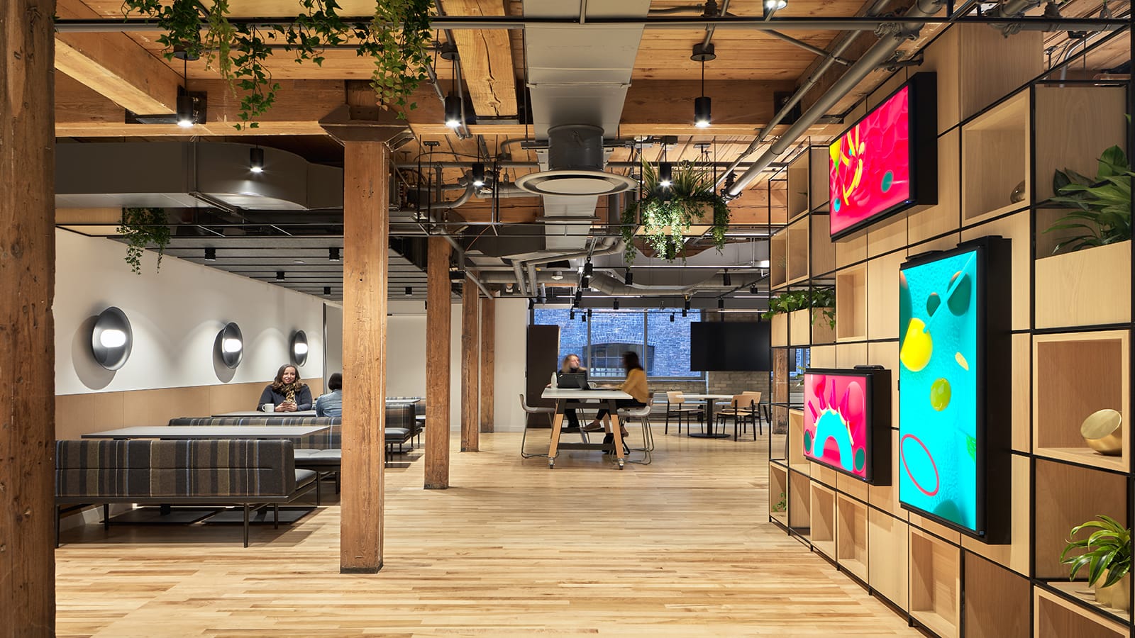
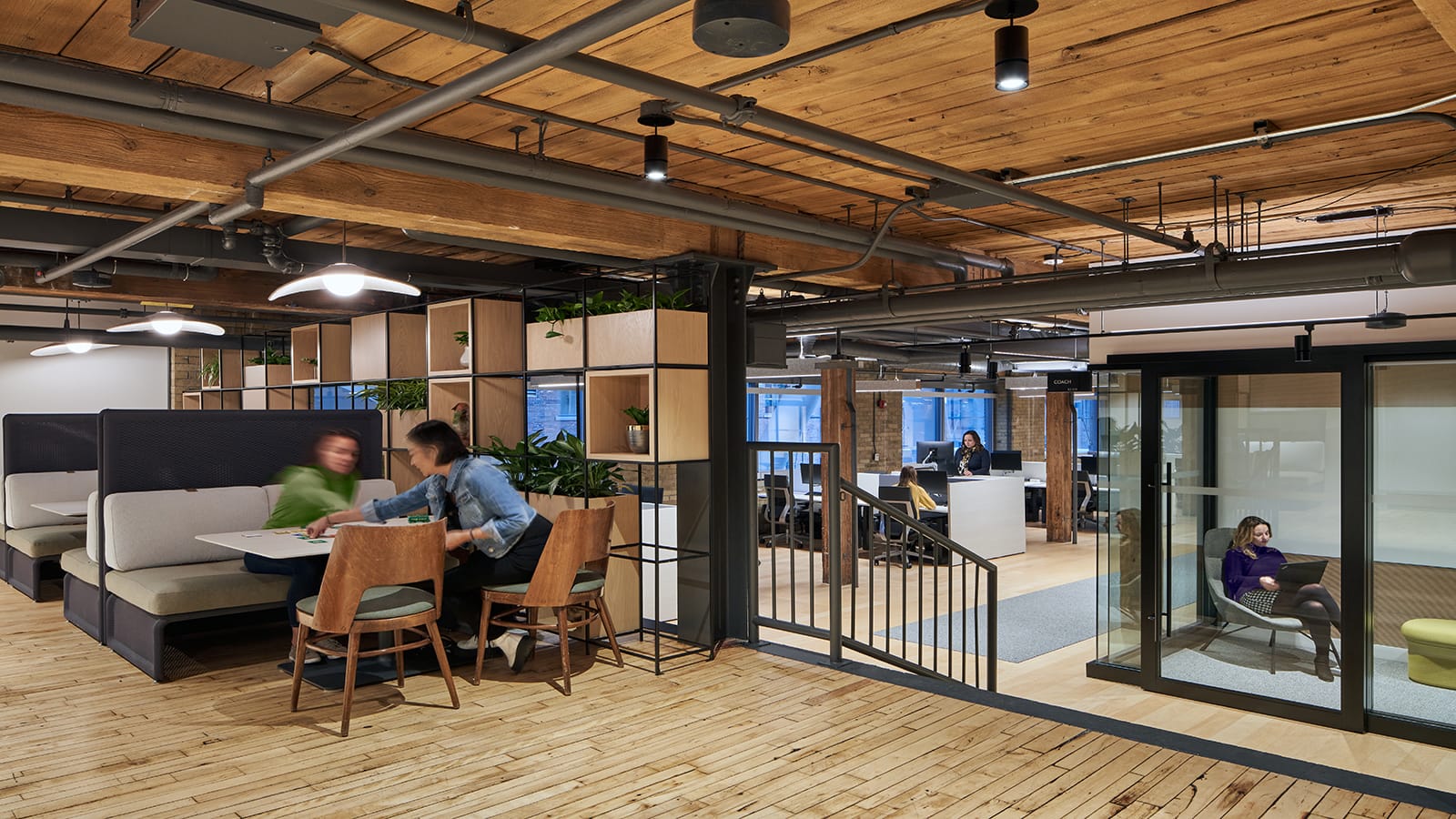
- State-of-the-art, high-tech environment within a heritage, brick & beam building
- Facility is distinct from other Sobeys locations, offering the appropriate environment, tools, and infrastructure to support working creatively and collaboratively to challenge status quo approaches and develop innovative solutions for business opportunities and challenges
- A virtual reality tour, user/experience guide, and workplace guidelines developed for change management
- Employee and visitor experience is central for developing seamless workflows and to stimulate opportunities for co-creation throughout the space
- Space features local artist graphics, lighting made from reused materials, and custom furniture fabricated by a resident industrial design student
Awards
- ARIDO | 2021 ARIDO Awards, Work Category
Summary
Sobeys Inc., Canada’s Family Grocery Store, dates back to 1907 and today boasts over 1,500 stores nationwide. The company strives to stay current with developing trends, anticipating customers’ future needs by providing new service offerings, products, and delivery models. With that in mind, a 25,000 square-foot space in a historically designated 1920’s brick and beam building in downtown Toronto was specifically chosen and designed to support Voila by Sobeys, the company’s e-commerce team. While honoring the structure’s original architecture, the design creates a forward-looking, state-of-the-art innovation hub to retain and attract tech-savvy talent. Comfortable, high-functioning, and user-focused, this downtown extension to the company’s suburban campus marks a transition to activity-based work and unassigned seating, a shift in contrast to Sobeys’ traditional way of working.
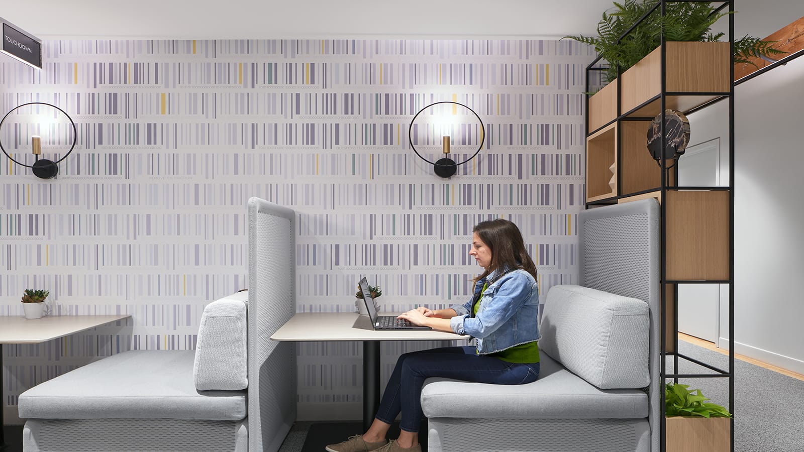
With equity, diversity, and inclusion as key tenets of the Sobeys ethos, the primary goal was to create an inclusive, inspiring environment that would elevate the quality of life for the Sobeys’ team. The design supports the preferences of introverts, extroverts, and ambiverts with an array of work modes that speak to differing tolerances for noise, light, and temperature. A separation between active and quiet zones offers acoustic comfort; a dropped acoustic-tile ceiling mitigates noise levels as does a limited use of carpet.
For improved air quality, wellness, and a minimal presence at open ceilings, ducts were raised and relocated under the acoustic ceiling. Variable air volume boxes were added for increased thermal comfort; with a thermostat in every room.
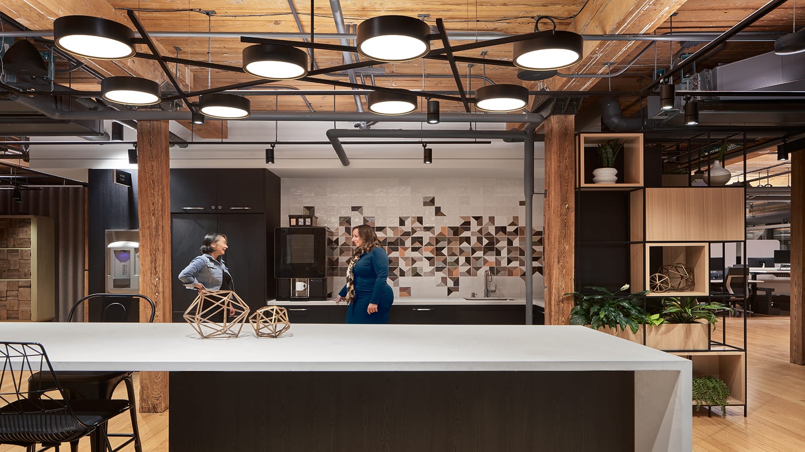
For wellbeing there are convenient water-filler stations and healthy snacks for all. Adaptable, moveable furniture with writable surfaces combine creativity with comfort. The design includes workstations, project rooms, lockers of varying size for user convenience, a work café, a prayer room equipped with pillows and mats, and a wellness room. There are five restrooms: one universal and four accessible and gender neutral.
Mindful of its impact on the community and planet, sustainability is a Sobeys priority. The design leverages and celebrates the original architecture wherever possible—wood beams, finishes, oak flooring, and brick façade—enriched by textiles and dark metal details to create a warm and inviting space. Recycled cans are custom light fixtures. Refurbished vintage and artisanal designed furniture is featured throughout, along with original artwork both digital and graphic. Furniture types are not repeated; every room and area is different, each with a bespoke identity. The talent of local artists, students from Ontario College of Art & Design, and craftsmen as well as Canadian manufacturers delivers character and personality.
The innovation hub encompasses three floors, each with a generous kitchen, welcoming social space, and an array of amenities. In key traffic areas throughout, digital boards emphasize brand. Two of the floors can transform into a double-level town-hall venue equipped with large screens and speakers.
An outdoor mezzanine overlooks a public atrium and adjacent brick and beam building. A new lift was added connecting the mezzanine to the new workspace to ensure accessibility and Sobeys’ security.
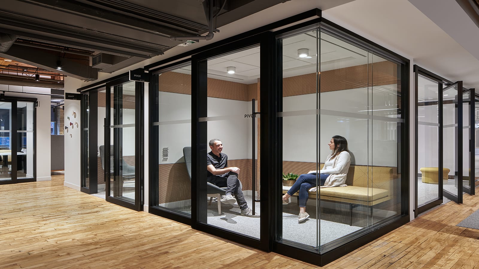
Transparency, achieved by wrapping the main circulation path around centralized glass-enclosed meeting spaces, lets teams see their peers and allows natural light to flood the floor. A series of enclosed and distinct collaboration settings, flexible to accommodate large or small groups and equipped with technology, support relaxed or formal interactions. Sensors measure space utilization to fine-tune meeting-room usage going forward.
Throughout all phases of the project, multiple stakeholders were engaged to name the site and select artwork, as well as the new logo that was to be featured throughout the space. In addition, IA and Sobeys collaborated on a user guide, digital and in print, that orients employees, as well as those from other Sobeys locations, and visitors to the variety of settings at the new downtown hub.
