By Erik Hodgetts, AIA, LEED AP | Project Director
February 14, 2017
IA’S STRATEGIC APPROACH AND DESIGN FOR JET’S NEW HEADQUARTERS IS FEATURED AT FUTURE OFFICES NYC 2017.
How do you apply the power of workplace strategy and smart design to a company that does not yet exist? In January, at Future Offices NYC 2017—a two-day seminar focused on workplace evolution for corporate real estate and workplace decision makers—Principal Erik Hodgetts and Workplace Strategist Christine Kenline, both with IA’s New York office, teamed with Jet.com Vice President and Creative Director Christina Antonopoulos to explain exactly how it’s done.
As an e-commence start-up yet to initiate its first transaction, Jet had outgrown its incubator space while developing its brand and culture. But that effort generated a strong vision for a first headquarters—a physical expression of the brand that would take Jet into the real world and grow its virtual presence.
A new building in Hoboken, with sweeping views of the Hudson River and Manhattan, was chosen for the site. IA was tapped to strategize and design the new work environment; visioning sessions and workshops established a powerful IA-Jet collaboration.
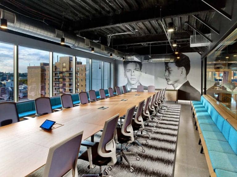
Packing materials—the experience of opening the box, the highpoint of a successful Jet transaction—inspired both design and floorplan. The playful Jet culture, its fondness for comic-book superheroes (including a nod to Hoboken’s local hero, Frank Sinatra), Jet-themed objects (think bikes and surfboards), signature colors (especially Jet Purple), and bold graphics are featured throughout to engage and inspire staff, guests, and recruits.
Spiraling from the entrance, a backlit purple ribbon-like feature mirrors Jet packing tape and leads into the open floorplan. The cross-shaped core mimics an unfolded packing box and defines the zone for social activities, the café, and the collaboration hub. With fully integrated AV technology and moveable bleachers on rails, the zone can easily expand for larger meetings.
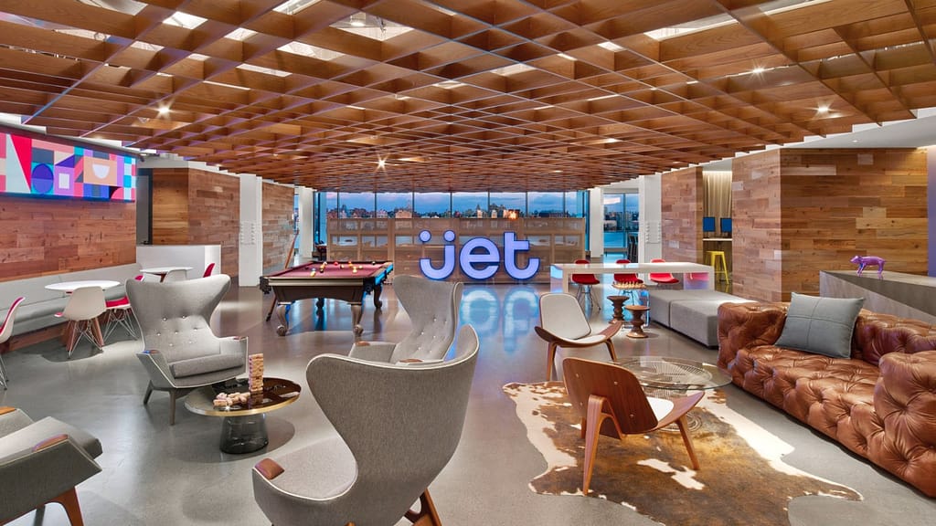
To strike a balance between hospitality and technology was one of the project goals; maintaining the buzz of Jet’s start-up roots was another. Like a hip hotel lobby, the large open reception area suggests luxe and casual comfort. Reclaimed wood panels add warmth to the walls, and there are a variety of seating arrangements, including a tufted leather sofa, mid-century modern chairs, and funky wood stools. A pool table stands ready for a quick game.
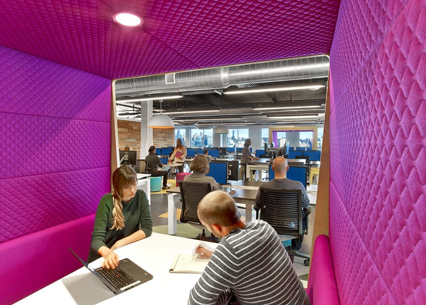
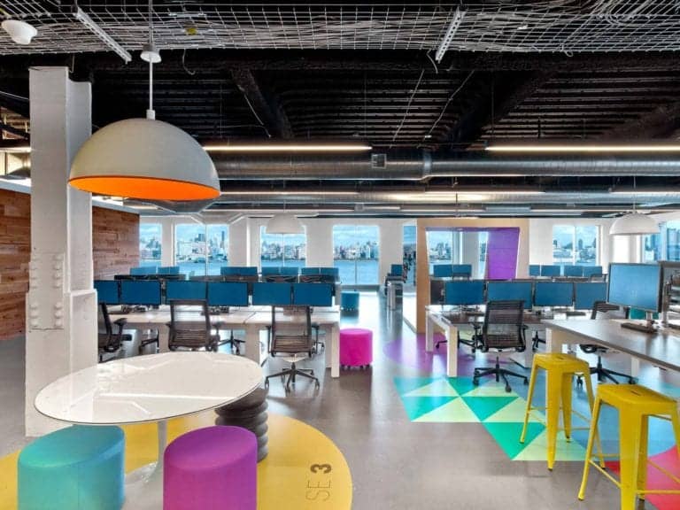
The remainder of the space, the work/technology zone, is 100 percent open with adjustable-height work desks (nearby lockers provide for personal storage). For working teams, most of the space is organized into eight-person pods, each with a common table, white board and adjacent booth for quick meetings. The remainder is dedicated to informal seating providing a variety of alternative work settings and postures.
This new headquarters is designed to provide options and flexibility for autonomy and resilience. The design has easily extended to additional floors at Jet has expanded, making adjustments for lessons learned from the current layout and incorporating new options for further advantage.
Like What You See?
Learn more about the Jet.com headquarters space from the perspective of its lead designer, Brie Samyn! Click below to listen to "Episode 72: My Favorite Project - Jet.com" from our podcast, RadioIA.
Jet.com's headquarters is definitely not lacking in expression of its culture (or purple)!


