More...
An office space is an extension of a company’s culture, a place to reinforce its brand values, and support its employees’ work. But how do you strike that balance for multinational firms that require both a consistent look as well as the flexibility to accommodate a vast array of cultural norms? Furthermore, how do you adjust accordingly if the space must also host clients from different market sectors, each with its own defined etiquette and decorum?
We posed these questions to IA principals, project managers, and designers working on accounts around the globe. We asked if and how they tailored a corporate space to a local market as well as the advantages—and challenges—that this provided. We expected to find that these approaches varied along industry lines, but what we found was that, with some exceptions, these decisions were ultimately a question of preference, branding, and the fine balancing act that occurs when working with both local and regional/national teams.
One Brand to Rule Them All
In the case of one software provider (a client who chooses to remain confidential) its offices are “like McDonald’s hamburgers in that they need to be exactly the same, no matter what, with no exceptions,” says Pietro Silva, IA principal and global design director on the account. The company’s product is highly customizable, and that’s part of what drives the decision to make its offices—which frequently host customer training sessions—so similar. “There is no room for local flavor,” explains Silva, who has completed tenant improvement projects on five continents for the client, “because the company wants visitors to concentrate on the brand, not the office space.”
The standardization creates a consistent customer and employee experience. It also results in few if any surprises for the core design team. But difficulties arise when local employees ask to deviate from the road map.
When that happens, the IA team strives to broker a compromise, working with the provider’s corporate team to see if they can honor the request without impacting the office’s overall design. It is a dance, Silva admits, requiring “time, education, and lots of meetings” with both parties. Rarely are even the smallest changes granted, aside from the occasional market-driven concession, such as a change in furniture because a supplier can’t deliver to that territory.
One notable exception took place at a location in India, where changes to this brand standard were deemed necessary to account for the cultural importance of the lunchtime meal. Ultimately, very few brand standards are above long-valued cultural traditions, and in India, the second meal of the day more closely resembles dinner than it might in the west. As a result, tech employees in this region have slightly higher expectations for mealtime accommodations than our client had seen in other countries.
Upon review of the space that had been set aside for employee meals, it was decided that, instead, a fully-functioning cafeteria would be better-suited to meeting employees’ expectations. IA was asked to create a new space for a longstanding brand that met (as closely as possible) existing brand standards.
Customization is Key
On the opposite side of the client coin is another confidential client that is an online retailer, for whom IA develops a local theme for each office. “Placemaking is very important to them,” says Lynn Vandeberg, IA principal and leader on the global account. "Each design is [created] to express that particular city and its team while still being identifiable as the brand."


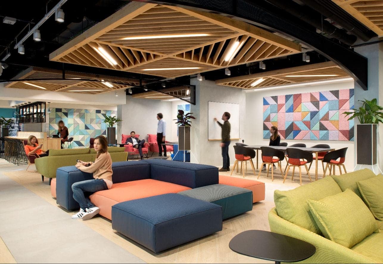
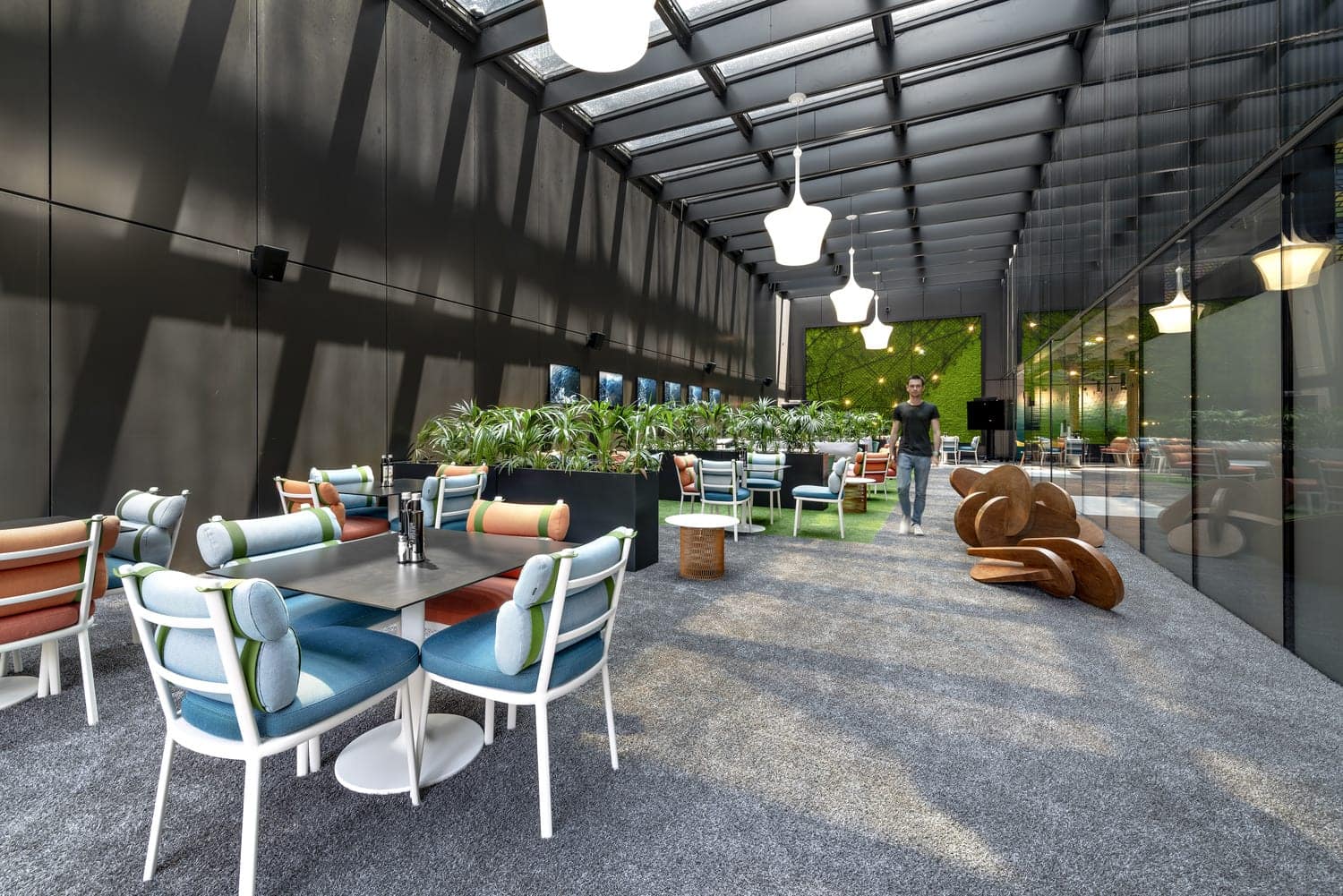
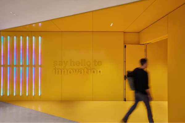
All three of the above flexible meeting/cafe spaces were designed for the same client, for whom IA designs spaces spanning three continents. Incorporating the feel of the local area, its people, and its design aesthetic is an important part of the organization's brand.
IA accomplishes the latter by following a few company design standards, including room types and available technologies, but executing a sense of place in the remaining spaces is fair game. The retailer’s Austin office, for example, features a reclaimed-wood roof, neon roadside sign with the company’s mascot, and an eating space that emulates being outdoors.
The designers utilize everything from local artworks and materials to custom architecture and experiential graphics to achieve their vision, honed through meetings with the space’s business leaders and users. The result is an office that is tailor-made for those users’ needs and preferences, optimizes performance, and empowers employees.
But IA also considers the client’s customers. At the retailer’s Washington, DC branch, some employees have large private offices, despite that being anathema to company culture. The reason? Its government clientele have come to expect such accommodations. In Houston, the office’s tenor is upscale and corporate, an atmosphere preferable to its oil industry-heavy audience.
The designers utilize everything from local artworks and materials to custom architecture and experiential graphics to achieve their vision, honed through meetings with the space’s business leaders and users.
Tailoring a workplace to employees generates buy-in and a sense of loyalty; tailoring it to clients signals that you understand them and can meet their needs. Says Jim Brown, senior designer on the account: “That’s a great advantage for both parties, to know you are sitting across the table from people who share your values.”
Finding a Branding Balance
The optimal balance between customization and standardization has undergone continual calibration for an IA client specializing in networking services and information technology. Over the past decade, the firm has shifted from offices that were extremely standardized—where “we had 36 binders full of guidelines to follow,” says IA Senior Associate/Senior Project Manager Courtney Harms—to individual offices that embraced a broad variation of custom solutions.
Harms ascribes the change to the client’s acquisition spree. The firm “used to acquire a company, gut its offices, and remake them to [fit its own] guidelines,” she explains. But eventually management realized that approach was doing more harm than good. “By transforming [those workplaces and cultures],” she continues, “[the company] started to lose what it had purchased: the people who generated the ideas and technology.” Realizing the importance of being sensitive to users’ preferences, the company slowly began allowing employees—from acquired companies and otherwise—a greater role in defining their workspaces.
Harms and the design team still employ a set kit of parts, but their “look and feel change depending upon what the end users want to communicate,” she says. Color, materiality, and architectural components help achieve the differentiations, as do experiential graphics. The customization helps retain employees, critical for collaborative workplaces like this tech leader’s. The shared kit of parts offsets some of the cost; it also provides the company’s highly mobile workforce with common visual touchpoints at each office.
Working with multinational teams as they attempt to find this balance is a specialty unto itself. The approach speaks to the reality of today’s multinationals, where agility means survival, and efficiencies of scope can mean millions of dollars. In this fray, office design (and successfully expressing company values) can play an important role, acting as a bonding agent that brings together several distinct parts.
Spirits maker Bacardi exemplifies this. The company has been a patron of Latin arts and architecture since its founding more than 150 years ago in Cuba, with activities that include building a museum in Santiago de Cuba—where its first distillery was located—to commissioning one of the greatest commercial architects, Mies van der Rohe, to design office buildings, to sponsoring musical performances by salsa queen Celia Cruz.

Bacardi Barcelona thought it important to incorporate both their Cuban and Spanish ancestry in their space. We happened to agree. Photo © Jose F. Parreño
To unite under one roof the brand and its primary holdings—which include Martini, Grey Goose, Dewar's and Bombay Sapphire—the IA team has expounded on that broader history of arts patronage. In each office, alongside logos of those spirit brands, the team incorporates references to famous local musicians and artists into their designs.

Bacardi, Barcelona. Photo © Jose F. Parreño
An embodiment of this ideal is in Barcelona where the IA design team “incorporated Gaudí tiles into the bar area of our new office and selected lighting fixtures by a young local firm that were inspired by Joan Miró to reflect the local history and culture”, says Louise Matthews, Bacardi’s vice president of global real estate. It also led the designers to recommend that Bacardi commission local artist Xavi Ceere to paint a mural paying homage to the coastal cities of Barcelona and Havana (both considered founding cities of the company), as well as an abstract interpretation of the famous bat logo. In doing so, a narrative was created surrounding the community and the brand.
What Is the Right Narrative for Your Multinational?
When it comes to designing for multinational companies, to localize or not to localize is a matter of identifying whether community optics, customer expectations, or employee engagement is the primary driver. From there the rest is a matter of degrees, creativity, and how the individual facility chooses to engage with other aspects of the company. At the end of the day, working with a team that has a track record of successfully and diplomatically navigating this process is a significant advantage. It may take a village to fill an office but it can take several countries to design one.
IA is a global firm of architects, designers, strategists, and specialists. We focus exclusively on environments through the lens of interior architecture—a radical idea in 1984, when IA was founded. We are highly connected agents of change, committed to creativity, innovation, growth, and community.
IA is a global firm of architects, designers, strategists, and specialists. We focus exclusively on environments through the lens of interior architecture—a radical idea in 1984, when IA was founded. We are highly connected agents of change, committed to creativity, innovation, growth, and community.
Designing for a multinational brings with it some unique challenges.


