More...
As an interior design and architecture firm, we enjoy flexing our creative muscle by incorporating a variety of building materials into our projects. Any given material might have a myriad of applications, the use of which could be justified for purely aesthetic purposes, or for mostly practical reasons. Few materials, however, can find the equilibrium between the two quite like concrete. In this post, we review some of our recent work and 7 projects that prove that concrete can be as beautiful as it is useful.
What material should we use for our convertible indoor/outdoor space?
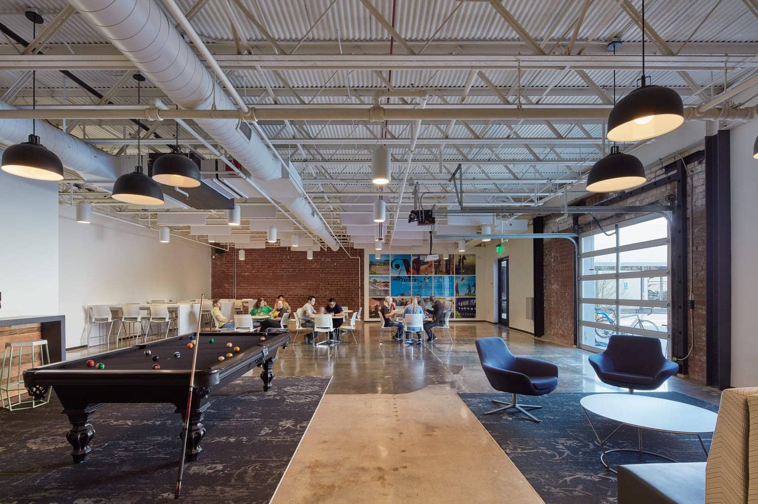
Stained concrete makes a bold statement in this Bunim Murray recreational area. This space not only needed to be cool and durable, but also a usable indoor/outdoor area for company events. The durability of concrete made it the obvious material of choice, and some creative staining made it perfectly in-line with Bunim Murray's mission.
What's best for a high-traffic space?
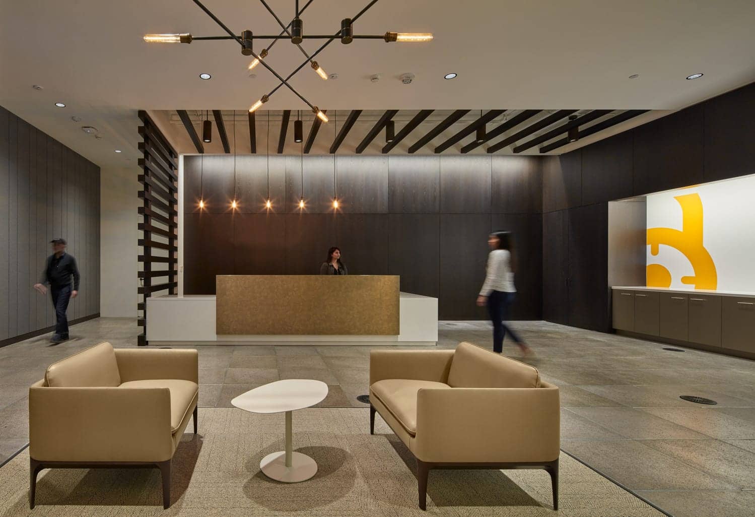
When a long-term IA client asked us to help them create a functional, but beautiful lobby space, we took several needs into consideration. The reception desk was going to be a very high-traffic area. The organization's branding included mostly neutral colors. A majority of the employees spent a lot of time with their hands on their keyboards. Maintaining an energy-efficient building was deemed highly important.
Ultimately, the IA design team opted to utilize a raised floor of concrete panels that was durable, energy-efficient, and 100% on-brand.
How do we make our space both fun and practical?
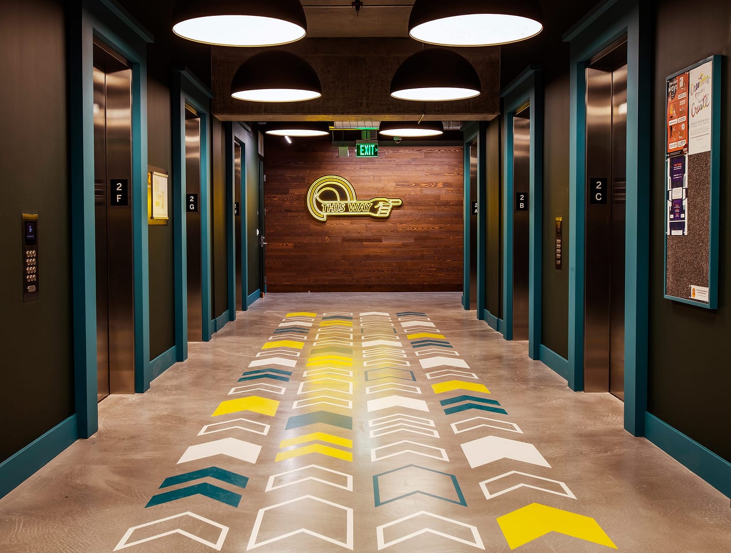
Similarly, a Seattle-based tech giant found that they had needs in common with the above example. They had certain spaces that would be high-traffic areas utilized by a large number of professionals. As IA was brought on to help define workplace standards and strategy, we soon identified the importance of wayfinding signage in this client's space, and made sure to have a little fun with their existing branding. The end result was a heavy reliance on EGD on stained concrete surfaces throughout the building that incorporated homages to local culture, company branding, and a high degree of practicality.
How do we make sure our office is as flexible as we are?
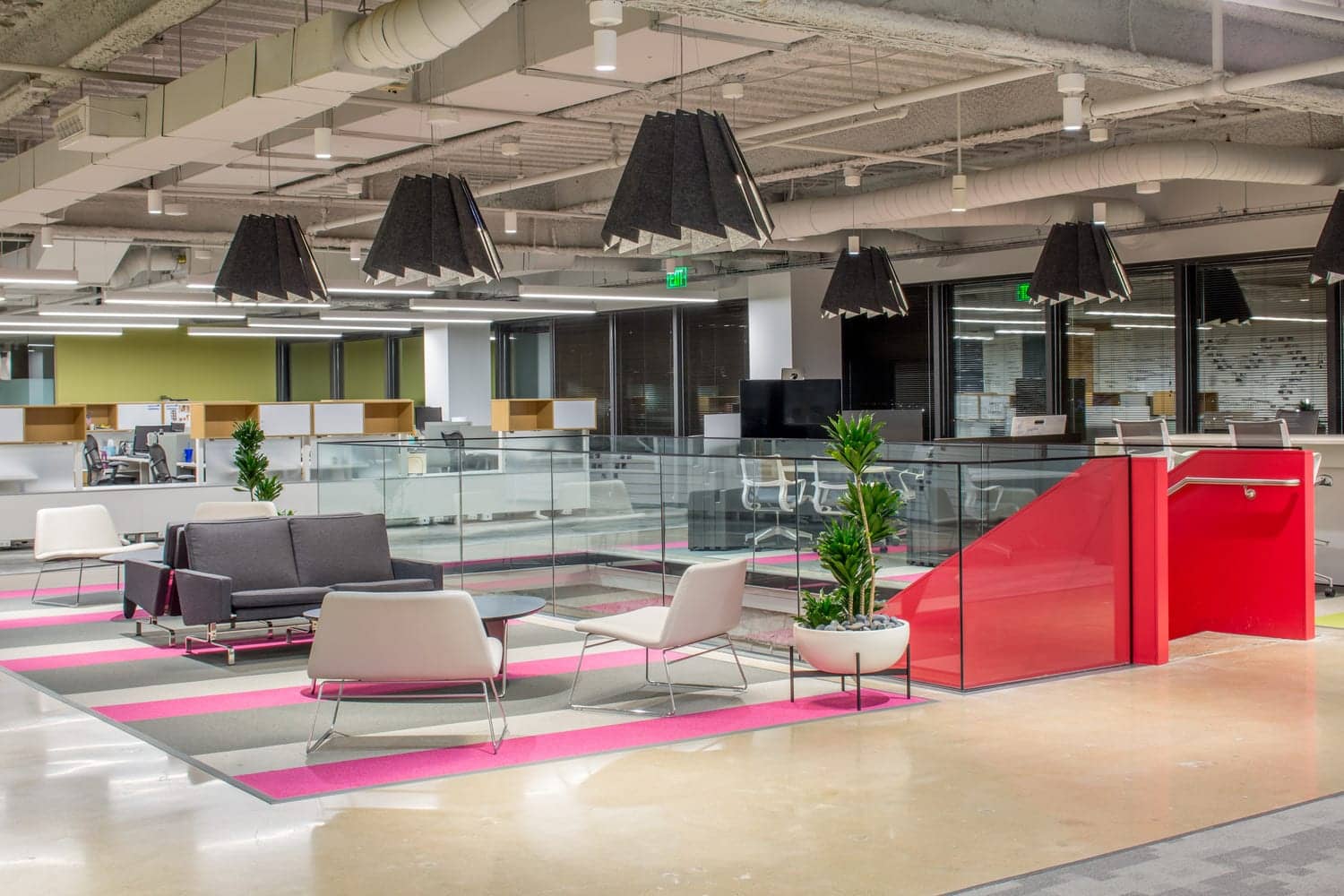
When it came time for the team at Match.com to renovate their office space, they knew that they wanted to keep things flexible. IA developed a plan that included reconfigurable office spaces with modular desking systems, and a mostly open plan. The IA team decided it made the most sense to repurpose the existing concrete to feature Match.com's unique branding. This is most evident in several areas where the subtle, neutral tones of the stained concrete flooring frames the bright pops of color featured in the unique carpeting throughout. Says David Holt, Design Director for the project, "We polished the existing concrete. It wasn't quite a mirror, but it was pretty shiny as the client wanted a balance between the refinement of a polish and the scrappiness of all the cracks and imperfections. We used no topping anywhere."
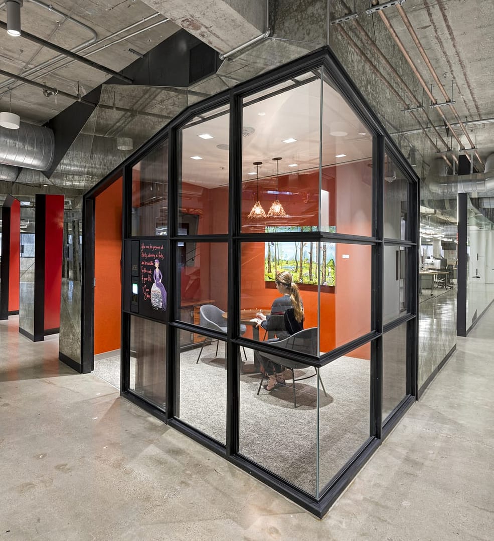
As Capital One realized, concrete isn't just for flooring. When it came time to design their Digital Lab in San Francisco, all parties agreed that playing off of the existing concrete structure was in-line with their mission statement of transparency, and their desire to create an edgy creative space for the digital masterminds inhabiting it. As an added bonus, the concrete columns seen throughout the building also offer convenient access to power and data fences, improving connectivity and adding functionality to several multipurpose meeting areas.
How do we let our creative minds flourish?
Marketing giant Conversant realized early on in the development of their new workspace that they wanted to develop a hive for creativity. Painting their concrete with a matte finish was simply an extension of this effort. As Conversant President Ric Elert noted in a Chicago Tribune article, “If you’re building an interface for a software product, you can project it onto the wall, mark it up, take pictures of it — [the space is] just built for a lot."
How can we highlight our brand?
"Luckily for us this was a new build space so the concrete was in brand new condition. We lightly polished and sealed the general concrete floor and painted the Jamba Juice brand at both receptions." says Katie Lazarine, IA Senior Designer of the project. "Concrete is a deceptively complicated specification to write. You can specify polished, sealed, stained and/or micro-topping...we always try to do a mock-up to ensure that all parties are happy with the final product."
"Concrete is a deceptively complicated specification to write. You can specify polished, sealed, stained and/or micro-topping...we always try to do a mock-up to ensure that all parties are happy with the final product." - Katie Lazarine, Senior Designer.

