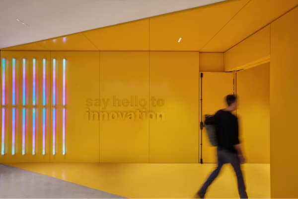
An iconic branded wall with a biophilic element becomes an Instagrammable feature. Peloton Customer Care Center, Plano, TX. Photography © Thomas McConnell.
Peloton makes the internet-connected stationary bike that creates a live spin-class in the privacy of your home—or wherever you position it—for your convenience. Choose when to use it, and a top-notch instructor (each has a distinct personality and a following of thousands on social media), along with live competitors, will join you in real time for a class, or choose from 11,000 on-demand workouts with your music, all streamed on the bike’s large mounted touchscreen. The emphasis is on your health, workout, and preferences—a simple concept reflected in the focus and efficiency of Peloton’s new customer care center, where technicians, equipped with an array of Peloton products, talk you through product modifications and adjustments as they do them with you.

Staff members are equipped with an array of Peloton products. Peloton Customer Care Center, Plano, TX. Photography © Thomas McConnell.
Adept at expressing their thoughts and requirements, the client team understood what they felt and how feeling would serve the space. Simplicity was chosen as the key concept and design motivator. The workspace takes its cues from the aesthetics and elegance of Peloton’s products—focused, functional, health-giving. IA’s use of a clean zen-like design speaks to the specialized mission of the new space—customer care—and relies on the architecture’s components with minimal but meaningful accents and details.
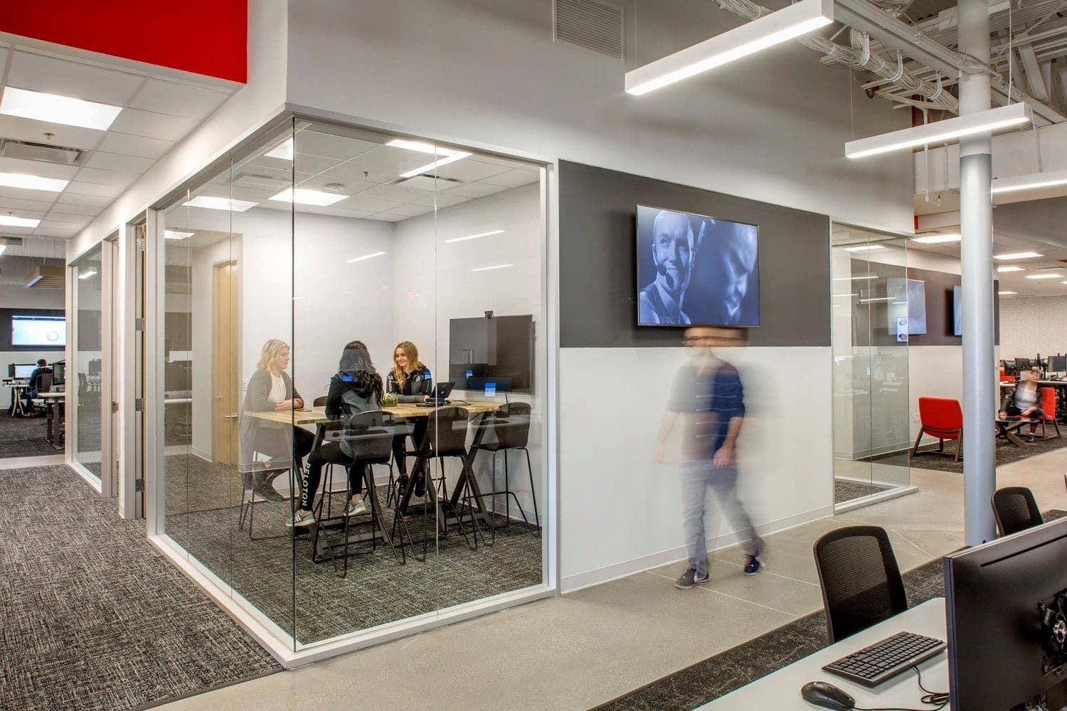
This meeting area illustrates perfectly how the design relies on components of the architecture and minimal but meaningful details. Peloton Customer Care Center, Plano, TX. Photography © Thomas McConnell.
The building architecture provides two entrances to the suite, and the one at the main lobby opens to the reception desk. The other, at the center of the building, opens off the main corridor with large preexisting glass doors (IA upgraded the doors to frameless glass for a more transparent opening), and nearest to the parking lot, and opposite another tenant with identical glass doors. Peloton saw this as a branding opportunity to create a fun and vibrant impression for those who would miss the receptionist’s greeting. Plus, an iconic branded feature would provide a partial shield for the breakroom location. Two free-standing walls, clad in sleek black tile, meet at a right angle. One of the walls displays the Peloton logo at the center of a large moss overlay, introducing a biophilic element, texture, and color for contrast under bright lights at the ceiling. The walls provide privacy for the open space they conceal and, in addition, create an instagrammable feature, which was one of the design goals.
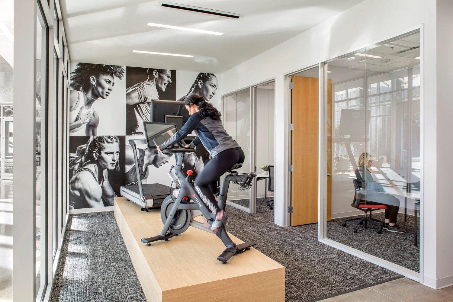
Large-scale wall graphics are used sparingly. Peloton Customer Care Center, Plano, TX. Photography © Thomas McConnell.
Large-scale wall graphics, carefully placed in a few locations, along with very simple paintings featuring bold and evocative brush strokes, add a sense of movement and momentum. Digital messaging throughout reflects real-time stats and live classes. The murmur of technicians assisting users on the phone adds a sense of underlying energy and excitement. Walking the floor, you are immersed in the brand.
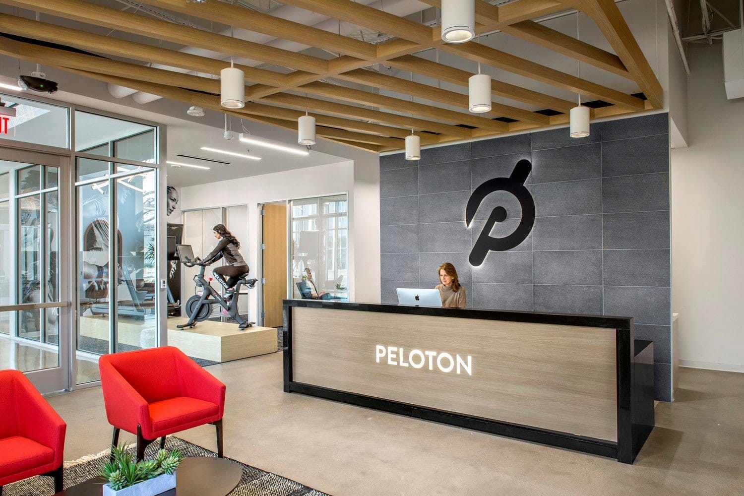
A warm wood lattice at the ceiling carries the zen reference forward. Peloton Customer Care Center, Plano, TX. Photography © Thomas McConnell.
The use of black tile is repeated behind the reception desk in contrast to a warm wood lattice at the ceiling. Throughout, there is an emphasis on natural materials for furniture and the use of green, black, and the brand’s red-orange accent colors. The 90 workstations with sit-to-stand benching are complemented by an array of alternative spaces: eight huddle rooms, four conference rooms, 12 phone rooms, a boardroom and a training room. The new customer care center creates a work environment that is infused with its goals and purpose.
IA is a global firm of architects, designers, strategists, and specialists. We focus exclusively on environments through the lens of interior architecture—a radical idea in 1984, when IA was founded. We are highly connected agents of change, committed to creativity, innovation, growth, and community.
IA is a global firm of architects, designers, strategists, and specialists. We focus exclusively on environments through the lens of interior architecture—a radical idea in 1984, when IA was founded. We are highly connected agents of change, committed to creativity, innovation, growth, and community.


