By Lindsey Torpey, RID, NCIDQ, IIDA | Designer
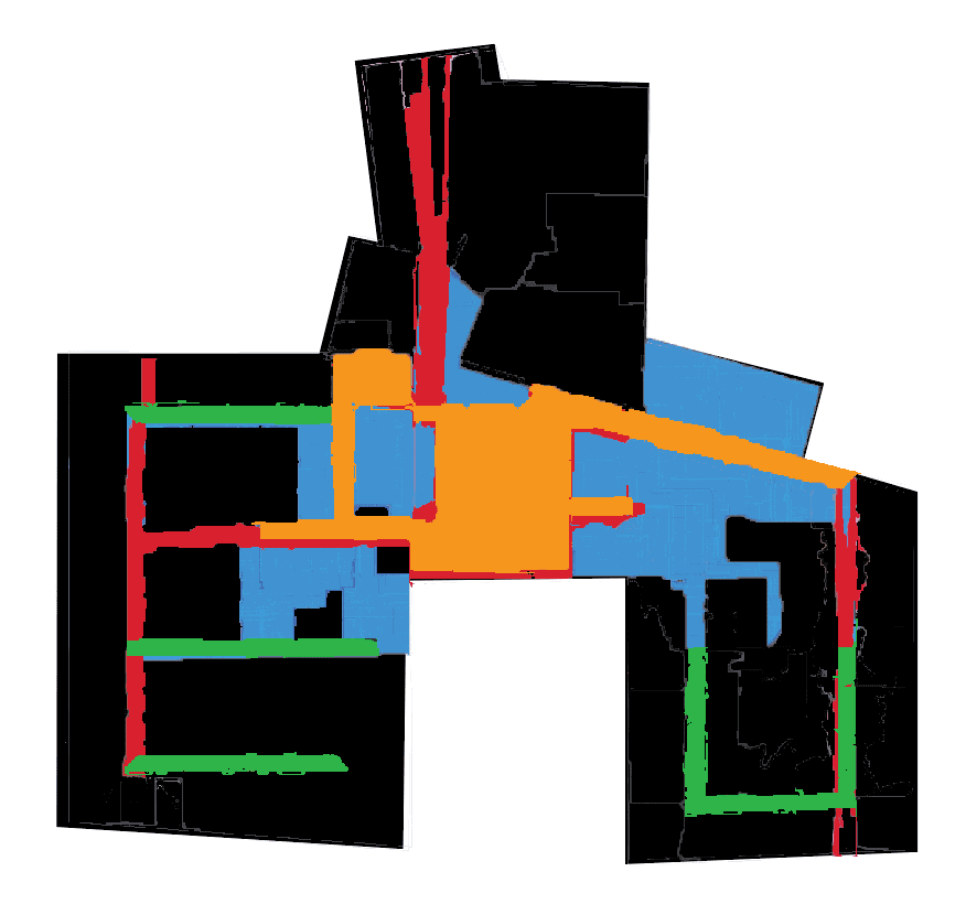
Overlay of areas most likely to facilitate collaboration in example workspace.
Built environments that we move within and through every day play a significant role in our life, although we may think of them as simply background. The types of spaces in which we live and work, based on their plan, design, and maintenance, significantly affect our actions and how we think and feel. Is the space awkward and inconvenient? Is it inspiring or depressing? Is it well-lit or dark? How can designers know what will be the best configuration of space for a given environment in advance of build-out? To analyze patterns of architectural space and determine their potential for a particular use, there are multiple techniques aided by software to choose from that yield a variety of graphs and maps, each with a specific intent. These computer-generated aids can’t dictate design, but they do provide valuable information for the use of expert and innovative design teams.
Case in point, with the increased emphasis on collaboration, how do you know if a layout has the potential to inspire and achieve the level of collaboration anticipated? The designer will want to consider how users move through an existing space to ensure that a new design or a redesign incorporates an effective plan or modifications that will optimize opportunity for collaboration. But in addition to on-site observation and proven expertise, you might want to consult two basic types of software generated aides: a visibility graph analysis (VGA) and a convex map analysis, as well as the three sub-groups of the latter: space integration, mean depth, and degree of connectivity. Developed under the banner of space syntax, a set of theories and techniques for the analysis of spatial configurations pioneered at The Bartlett, University College London in the late 1970s and 1980s as a way for urban planners to understand the social effects of their designs, these aides provide insight into the design of space and social interaction.
VGA Graph
To identify visual connectedness, a VGA analyzes sightlines throughout a space. Across the floorplan under consideration, the software draws lines to represent every sightline possible within the space. As shown in Figure 1, once the sightlines are drawn across our workplace example, the software color-codes the graph for ease of interpretation. Red lines indicate the greatest concentration of sightlines crossing; dark blue lines indicate the least concentration of sightline crossings.
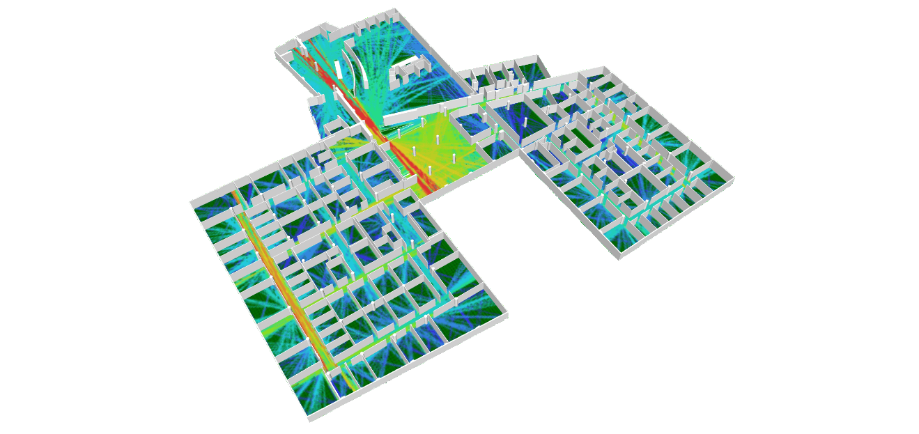
Figure 1 – VGA with a 3D view of the workspace. Red areas are more visually connected spaces; blue areas are less visually connected.
The areas color-coded red indicate a definite visual connectedness. If you’re standing in a red area you will be able to see more of the workplace; in a dark blue area you will see less and therefore be less visually connected. Furthermore, workplace users will be able to see into the red areas more than into the dark blue areas. Figure 1, also shows that the corridors and paths seen in the red/yellow areas have the strongest visual connection to the main area of the workplace. Users will be seen more and see more when they move about in these areas; collaboration is more likely to occur as users move through the hallways along these paths.
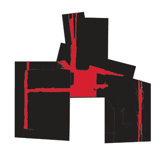
Figure 2 – The main areas with the most active actual visual connection isolated.
Convex Map Analysis
Convex maps function differently than VGAs because they analyze how particular components of the built environment relate to other components around them. To create a convex map the first step is to let the software know what constitutes the space components by identifying the shape of each space or room within the floorplan. Each office, common area, corridor—all spaces—are components of the floorplan. For greater detail and to better identify individual sections of a corridor that may be more suited than others for collaboration, the corridors should be separated into smaller components. There are three variations of a convex map analysis: integration of space, mean depth, and degree of connectivity.
Integration of Space
The integration of space analysis map looks at which components of the workspace are most integrated or easily accessible from all other components and then color-codes them accordingly. For a clear understanding, consider drawing a path connecting any two given points on a floor plan. Then, repeat this for all possible combinations. The areas where the most overlap occurs are the most integrated spaces. In Figure 3 the most integrated areas are red; dark blue shows the least integrated.
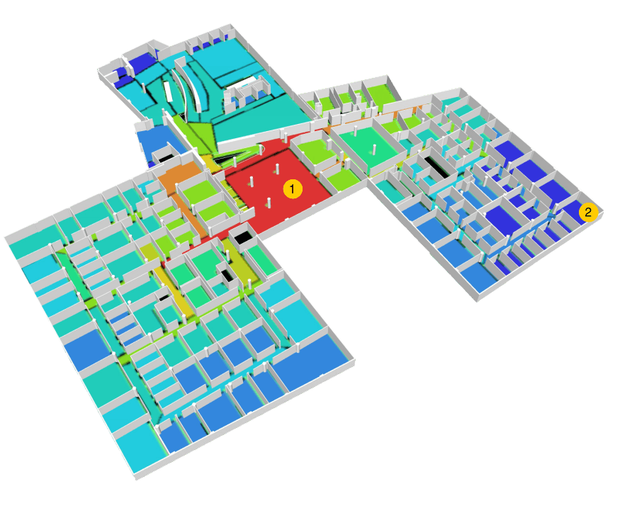
Figure 3 – The Integration of Space convex map overlaid with a 3D workspace view. Red is the most integrated; dark blue is least integrated. Area #1 is the most integrated and area #2 is one of the least integrated spaces.

Figure 4 –The most Integrated areas isolated from the Integration of Space convex map.
Mean Depth of Space
The mean depth of a space analysis map uses the same concept—the accessibility of components—but considers how far or deep into the space each component is located relative to all other components. In most cases (but not all) this will be the inverse of the integration of space map. Consider mean depth as the distance you would have to walk within a space to access a specific component if you were starting from a central point. The further the walk, the deeper that component. In Figure 5 the red components represent the deepest or farthest spaces while dark blue represents the most shallow or shortest distance to a particular component.
The integration of space and mean depth of space analyses are thought to correspond to potential social encounters; the more integrated and the shallowest areas will host more social interaction because a greater number of users will pass through those spaces to reach their final destination.
In Figure 3 and Figure 5, the color-coding indicates that the area noted as #1 is both the most integrated and has the shallowest depth within the workplace. Comparatively, area #2 is an example of the least integrated and deepest space within the workplace. Area #1 would be better suited for collaboration, while area #2 would be more suited for activities requiring focus with little distraction. The maps themselves do not make recommendations; they simply provide information that allows designers to consider an existing or planned space and make determinations about configuration to achieve that balance and variation of space needed to meet and exceed project goals.
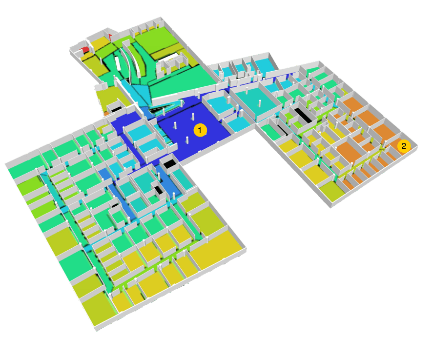
Figure 5 – The Mean Depth of Space convex map overlaid with a 3D workplace view. Red indicates a utility closet, the only abnormally deep space; dark blue shows shallow spaces. Area #1 is the most shallow; area #2 indicates some of the deepest space.
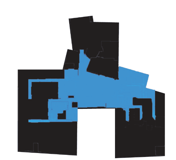
Figure 6 – The most shallow depth areas isolated from the mean depth convex map.
Degree of Connectivity
Analyzing connectivity equates to measuring the number of immediate neighbors for each component. The higher the number of neighbors, the higher the degree of connectivity; the lower the number of neighbors, the lower the degree of connectivity. In Figure 7, red indicates the highest degree of connectivity and dark blue represents the lowest degree of connectivity. The corridors connecting multiple offices have the highest degree of connectivity. This not only informs designers of where conversations are more likely to occur, but also assures that the right work neighborhoods are being connected and that this reflects business processes.
To visualize this, consider hypothetical Teams A, B and C. If there is a high degree of connectivity between the locations of Teams A and C, but Team A more regularly collaborates with Team B, stakeholders can make important decisions about how to realign the space so that Team A has a higher degree of connectivity to Team B.
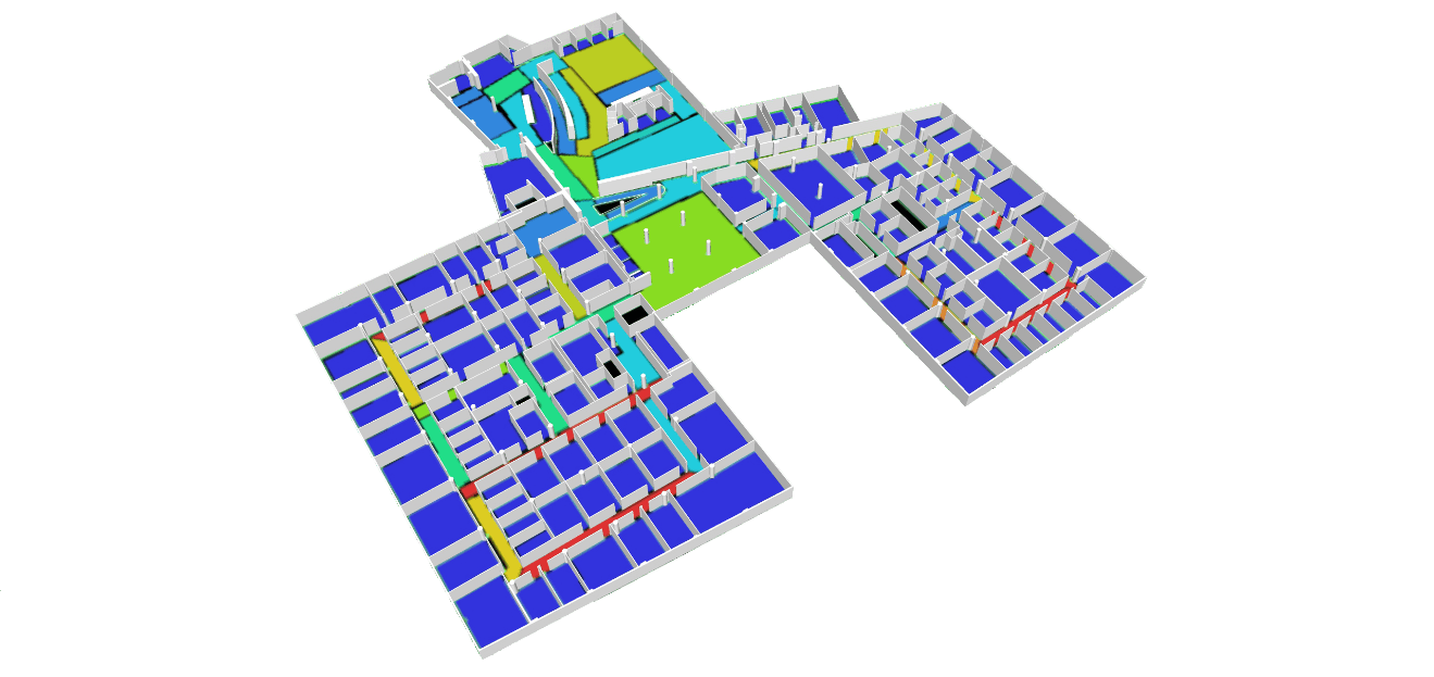
Figure 7 - Degree of Connectivity convex map overlaid with a 3D workplace view. Red indicates more highly connected areas, blue lesser-connected spaces.

Figure 8 - Floor plan of the most connected areas isolated from the degree of connectivity convex map.
Conclusion
Using these analyses provides a greater understanding of how opportunities for collaboration could be designed into a built environment. Furthermore, it allows designers and clients to review plans and have a shared language for discussing how workplace strategy goals are being designed into spaces.

Figure 11 is a compilation of Figures 2, 4, 6, and 8, the most successful areas of each of the four graphs and maps discussed.
Even though the workplace example considered shows a separation between offices and open areas, which may appear to hinder collaboration, with the help of software, designers are able to verify possible social interactions along circulation paths, meeting nodes at path crossings, and opportunities to embed events or moments along the user’s journey. Regardless of how well a space may be designed for collaboration, users need to actively participate in the workplace with co-workers to build strong social networks, teams need minimal turnover to develop long-term relationships, and leaders have to nurture a culture and sense of place to inspire collaboration. But, tools like the those mentioned here are invaluable for enabling teams to glimpse into the future and predict how even subtle design changes translate into human behavior.
Anticipating the Built Environment - via @IAarchitects


