By Alexandra Markey | Senior Designer | September 5, 2017
ASSESSING WHEN A MINIMALIST OR MAXIMALIST APPROACH IS RIGHT FOR YOUR WORKSPACE.
THE MINIMALIST APPROACH
In recent years, a renewed focus on minimalism as a design aesthetic, fashion trend, and even a lifestyle has pervaded society and pop culture. (Think Marie Kondo’s book ‘The Life-Changing Magic of Tidying Up’ and the popular media duo, The Minimalists.) Perhaps this longing for simplicity can be seen as a retreat from our complex, consumer-driven, high-tech world.
Minimalism is exemplified by the idea of “less is more” as first coined by architect Ludwig Mies van der Rohe. This approach involves stripping a design down to its bare essentials, and casting aside any elements that do not contribute to the pure beauty or function of an object or space. Dieter Rams’ “Ten Principles of Good Design” serves as a great roadmap for the minimalist approach.
Applying this approach to workplace design presents unique advantages:
- Reflects a culture of transparency and efficiency
- Supports sustainability by reducing excess building materials and products
- Celebrates the beauty found in simple details
- Serves as a reprieve from visual clutter and distractions
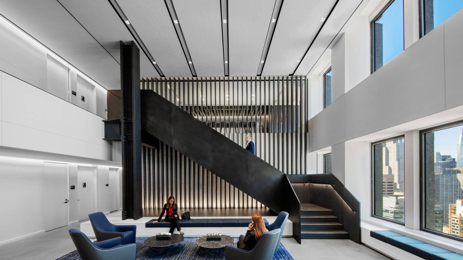
IA’s design of a Japanese corporation’s North American headquarters provides a great example of this. The client’s previous office space lasted 20 years and the goal for their new office was for the same lifespan. The final design featured timeless colors and materials that focus on quality and craftsmanship. The minimalist approach employed allows architectural details, like the beautifully lit wood fins along the reception staircase, to stand out.
Photography © Eric Laignel.
THE MAXIMALIST APPROACH
Yet, minimalism may not be right for every person or space. Some view the clean, sleek aesthetic of minimalism as cold and sterile. These individuals prefer a more exuberant design approach that sparks the imagination, a maximalist approach.
Maximalism is defined by the idea of “more is more” or, to quote architect Robert Venturi “less is a bore.” This style employs layers of color, texture and pattern to create a rich visual environment. Picture Kelly Wearstler’s designs for the Viceroy Hotels, featuring elaborate embellishments and ornate designs that serve as a visual feast for hotel visitors.
Beyond a personal design preference, a maximalist approach has its own benefits for corporate interiors:
- Statement-making spaces using layers of bold design elements
- Individual workspace customization
- Conveys a company’s rich history and culture
- Creative inspiration and imagination
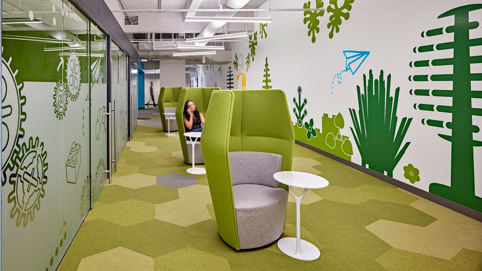
Consider the IA-designed headquarters for an educational product developer, which employs a maximalist approach to convey the business’s long history and culture of creative learning. The workspace features layers of bright color and pattern, alongside playful environmental graphics that are reminiscent of childhood. The result is a lively work environment that celebrates the company’s legacy and the products they create.
In the end, it should come down to a company’s culture. Whether the design is minimalist, maximalist, or somewhere in between, it is important to find the approach that is best-suited to a company’s unique culture and organizational behavior.
IA is a global firm of architects, designers, strategists, and specialists. We focus exclusively on environments through the lens of interior architecture—a radical idea in 1984, when IA was founded. We are highly connected agents of change, committed to creativity, innovation, growth, and community.
IA is a global firm of architects, designers, strategists, and specialists. We focus exclusively on environments through the lens of interior architecture—a radical idea in 1984, when IA was founded. We are highly connected agents of change, committed to creativity, innovation, growth, and community.

