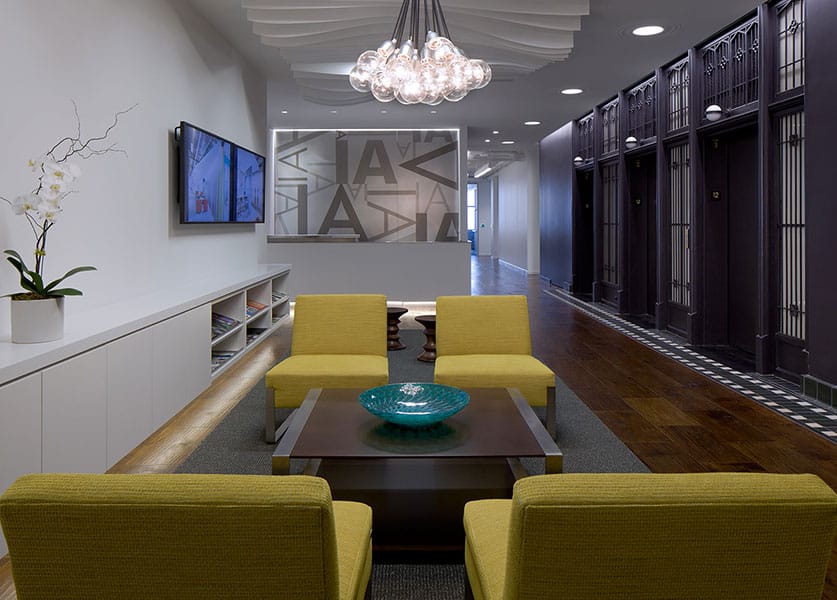
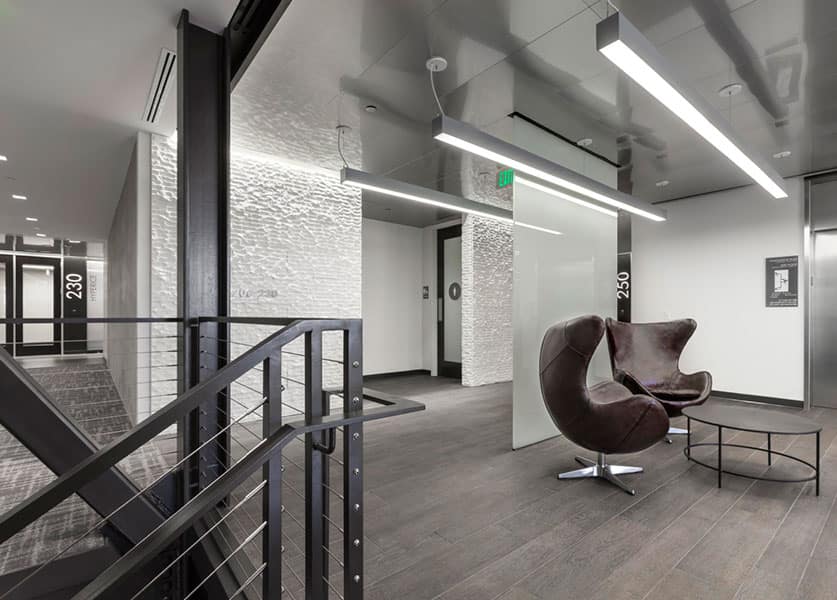
Form in the workplace plays an important role in the way we perceive space, and has a direct effect on creativity.

When we’re discussing form as it is applied to interiors, we’re referring to both an object that we physically see, a well as the negative space around solid objects. By both definitions, form plays an important role in the way that we perceive space. We’re all familiar with Louis Sullivan’s “form follows function” mantra, but the fact of the matter is that today, those features are more intertwined than a straightforward cause and effect. Form supports function and function informs form. It provides cues on how to use space, and it defines wayfinding and orientation.
The Guggenheim Museum in New York by Frank Lloyd Wright is a good example of form and human perception of space. Wright’s cavernous spiral first makes visitors feel small when viewed from the atrium: Here, form is somewhat disorienting. But once we move through the entry sequence and see the natural light flooding the museum, we naturally move up the ramp to experience the museum and its exhibits. Here, form helps define wayfinding.

For a confidential client in Manhattan, we’re also using form to inform circulation. In the amenity-heavy portion of our plan, we created a ribbon-like band that frames out a game room, becomes a banquette in a café, organizes a wall of graphics, and then defines bleacher seating in a screening room. Through a playful application in the client’s company color, form connects all of the spaces and becomes a meaningful form of branding.
Angularity and severe edges have been more common in commercial design over the last decade, a design preference that has married well with the existing footprint of most commercial buildings, which are typically rectilinear. Orthogonal design choices also typically support space efficiency: There is less negative space when you place squares into a larger square than you can circles into a square. But often times, our clients request a design that features more organic forms to soften that existing envelope. Non-rectilinear layouts have also been identified to support creative thinking and problem solving. According to a 2012 study published in Psychological Science, people tally up more ideas when wandering in circles than they do when following a square path.
For the same client that has a brand-specific band to inform wayfinding, we’re adding a radiused edge to the building’s sharp, existing angles to soften the existing form. People don’t walk in straight lines naturally, so we give them organic pathways to create a more natural environment. Similarly, for clients who don’t want benching stations or a similar rectilinear solution, we can turn to 120-degree workstations or radial work surfaces.

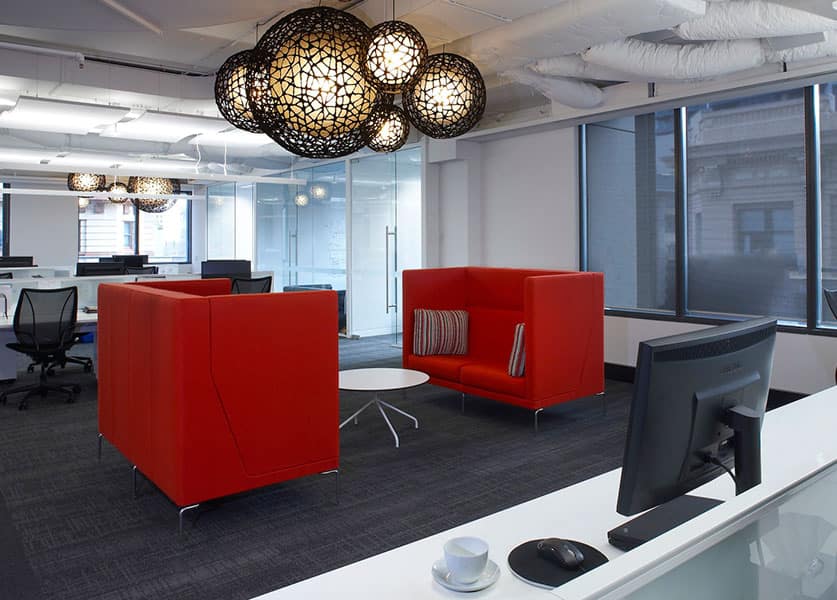
In amenity space, furniture that creates a cocoon environment—even if only perceived—is also a way to soften existing lines of a space. Think of traditional wingback chairs, or the more contemporary designs from companies like Haworth or Fritz Hansen. There are wings that cradle the user’s head for a sense of comfort and privacy. Another example is Keilhauer’s Talk sofa, which is configured as a very shallow “U.” Users can face one another, while their backs are still parallel to the sofa’s vertical support.
Angles and faceted architectural forms are still relevant. If you think about the negative space created by something round, it’s harder to use because you always have to consider the inverse space. If the negative angle isn’t too acute, that real estate is still very useful. But designing softer and more organic form requires more space, which isn’t always an option, especially as society moves to urban centers where real estate costs are less flexible.
