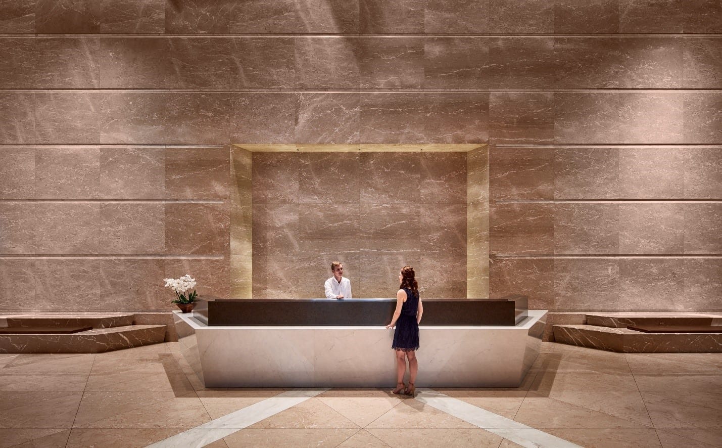
The building lobby of 155 North Wacker Drive. Photo © Tom Harris
The Story Behind 155 N. Wacker Drive
Like many of the buildings they’ve developed and managed, The John Buck Company (JBC) is a Chicago giant. Known for many properties along the beautiful Chicago waterfront, their reputation is synonymous with their work on Wacker Drive and Michigan Avenue, where they have transformed entire neighborhoods. Over the past 30+ years, their portfolio has since grown to also include projects in San Francisco, Washington DC, and everywhere in between.
As managers of 155 North Wacker (a building opened nine years ago), they came to IA with the goal of capitalizing on the amenity space within the facility. Familiar with a tenant conference center as part of a larger repositioning project in another facility, they knew they had an opportunity to provide a more high-end amenity for their tenants in this Class-A building. As IA Designer Bridget Schmitt, (charged with helping them realize their vision) recalls, “We had established a relationship with The John Buck Company. They saw IA as trusted advisors and experts in the area of creating great third spaces for tenants—they knew us as a building repositioning expert. ”
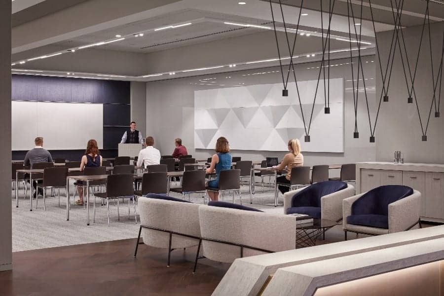
The existing space had functioned as a training area for 155 North Wacker Drive’s anchor tenant, who utilized the space 90 percent of the year. What was lacking, however, was the additional functionality that potential tenants sought. For example, based on feedback, JBC knew that social spaces which could be utilized outside of the typical work environment were in high demand. They also knew that such spaces would have to be usable for group meetings and individual ad hoc workspace, while still having use as a training facility. This would mean combining what had previously been two distinct spaces, while still allowing the areas to be used independently. Part of that process would include converting existing training space into a work lounge. Also, knowing that the anchor tenant had high expectations for the space, luxury was a must.
Design Challenges
The Design of 155 North Wacker
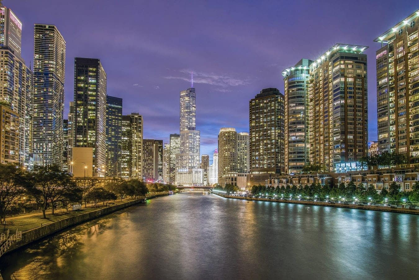
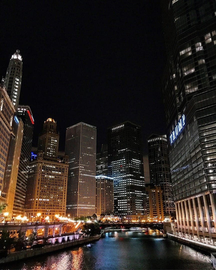
Those familiar with the Chicago waterfront will likely recognize the exterior of 155 North Wacker Drive. On the corner of West Randolph and North (Upper) Wacker, it is hard not to notice the cutaway southwest corner of the building, sporting a cable-supported wall of massive glass panels. The tower (designed by Goettsch Partners and developed by JBC), has a distinctive aesthetic, and it was determined by the IA design team that the renovated space should respond to the existing design of the building exterior.
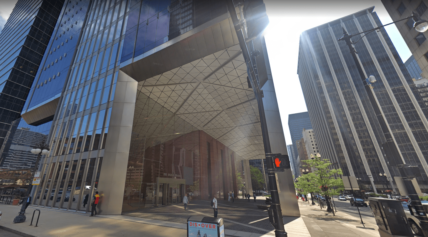
The southwest corner of 155 North Wacker Drive. Image courtesy of Google Maps.
The Hospitality Inspiration
With luxury in mind, much of the client’s vision for the interior of the project was inspired largely by the hospitality sector, in particular from projects with historical base buildings— which is not how one would describe 155 North Wacker. Marrying the signature, modern, angular geometry of the building exterior with a vision of classic, luxe hospitality would be the primary challenge of this project.
Taking inspiration from client feedback, the IA design team was able to incorporate several, seemingly conflicting concepts into the overall design.
Upon rollover: photography from the completed project. Images are copyrighted by Tom Harris.
All other images above are reflective of JBC’s hospitality-inspired focus and are courtesy of Unsplash.
While many of the more modern space treatments in hospitality (especially those local to the Chicago area) feature bright pops of color with playful nods to street art or modern sculpture, this style of approach wouldn’t be right for the building’s anchor tenant, or JBC’s vision. Instead, branding and business needs demanded a more luxurious, classic, and clean look.
Careful to incorporate cues from the building exterior, the design team started with the herringbone flooring, which seemed the ideal way to unite the sharp, angular, building exterior with the luxurious, more traditional feel of hardwood floors.

The Herringbone flooring is seen here by the curtain wall in area C. Photo © Tom Harris.
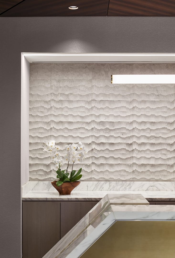
Similarly, the team found the two aesthetics to be in agreement when it came to their reliance on marble. The lobby featured rich white marble, so that element was brought into the concierge space, continued along the floor, and incorporated into the concierge desk.

The concierge desk is seen here, continuing the materiality of the lobby. Photo © Tom Harris.
Moving through the space, there are more references to the materiality of the exterior. A marble-topped half-height partition, the color palette of the carpeting of the event space, and the furniture selection all echo an appreciation for smooth surfaces and sharp angles, creating additional ties to the desired more traditional, hotel lobby-like aesthetic.

The lobby area most readily illustrates the juxtaposition of a modern business tower and hospitality space. The angles in the concierge space tie into the building’s exterior design, and the choice of light fixture and some furniture selections eschew any influence of a historical hospitality space. At the same time, the use of luxe materials—eucalyptus, water-jet stone, and polished brass—refer back to an earlier age of Chicago luxury hotels.
The Shape of the Space
It was apparent that the shape of the space would not easily lend itself to a multi-purpose environment. The plan in question featured a concave pentagon (as the diagram below shows); working around its tight angles meant that some creative solutions would have to be custom-built.
Fig. 1. – a diagram showing how the space was utilized prior to the renovation.
In addition, the angles and the absence of natural light made the area dark and hampered the team’s ability to create a desirable social space. Interestingly, the opposite side of the building didn’t suffer from this problem as it was built with floor-to-ceiling windows. The building exterior had been, in effect, asymmetrical.
Because the exterior wall (the left side of figure 2) was so detrimental to the goal of creating an inviting environment, the decision was made to replace it with a curtain wall, which not only added to the feeling of brightness but also created an illusion of height.
To further establish the social area as a bright and open space, IA’s in-house lighting design team created a custom stretch-fabric LED-backlit “skylight” in the ceiling that helped to exaggerate the amount of natural light the space actually receives.
Seen above are two views of the Southeast corner of the tenant work lounge. Interior "after" photo © Tom Harris.
Permit Concerns
The lobby and reception area feature a high volume of traffic. From the north side comes a steady flow of foot traffic from the nearby parking deck, while escalator traffic from the west brings visitors and tenants directly from the front doors. This traffic would prove very important, especially if the redesigned space in area C (reference figure 1) would serve as a standalone work or event zone (in which case a high amount of foot traffic and noise would render the space virtually unusable). IA had to carefully balance security and acoustic separation between the public area and the conference center.
It was this traffic and that of the projected increased occupancy that contributed to the city permit office’s desire to wall off the proposed work lounge. A matter of safe egress, the city thought it safest to direct traffic around a fixed barrier (a full-length wall) in the event of an emergency. Without such a barrier, they feared a potentially dangerous bottleneck would be created.
But such a physical barrier would defeat the ultimate goal of the project to create a flexible, combinable space. However, the team was able to identify this concern early on in the design process, and a dialogue was begun with the city permit office well in advance.
Fig. 3 – Foot traffic would form a natural bottleneck outside of the operable walls in the case of an emergency.
IA reviewed the project in depth with the city and created an innovative solution that met both safety requirements and the client’s vision.
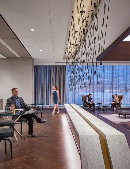
Pictured here is the low wall developed to create a clear egress for the new space. On the top left of the image is seen one of the vertical operable folding walls.Photo © Tom Harris.
Without compromising the option to combine conference rooms, a 25-foot-long low wall paired with a custom decorative light fixture would serve as the solution. It would allow the space to maintain its desired flexibility yet delineate a clear egress path. This visual barrier would also be the perfect opportunity to bring some of the lobby’s angularity into the newly-designed space.
The Results
The renovated amenity suite is now a signature space that distinguishes 155 N Wacker Drive as a leading Class-A+ building focused on providing outstanding service to its tenants. The anchor tenant (who inhabits the training areas A and B for the majority of the year) now finds their training spaces much more useful and visually appealing. The new individual work area is regularly in use—brighter, more comfortable, and more luxurious than ever before.

The new social space, which had previously been relatively dark and uncomfortable can now function as a cozy alternative work space during the day, and as an elegant, hospitality-inspired event space at night. Photo © Tom Harris.
IA is a global firm of architects, designers, strategists, and specialists. We focus exclusively on environments through the lens of interior architecture—a radical idea in 1984, when IA was founded. We are highly connected agents of change, committed to creativity, innovation, growth, and community.
IA is a global firm of architects, designers, strategists, and specialists. We focus exclusively on environments through the lens of interior architecture—a radical idea in 1984, when IA was founded. We are highly connected agents of change, committed to creativity, innovation, growth, and community.

