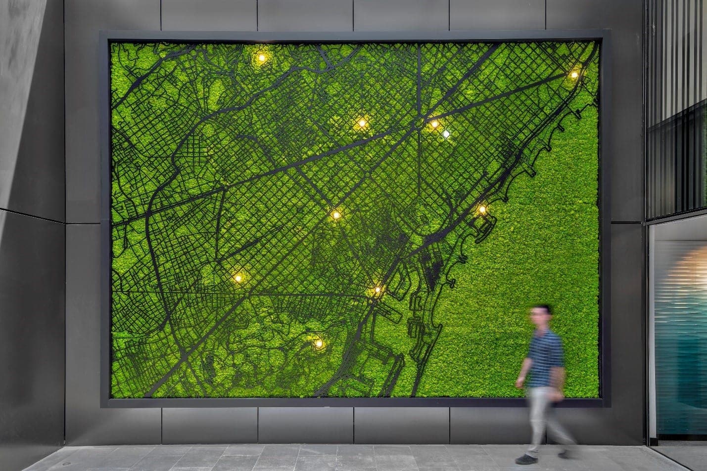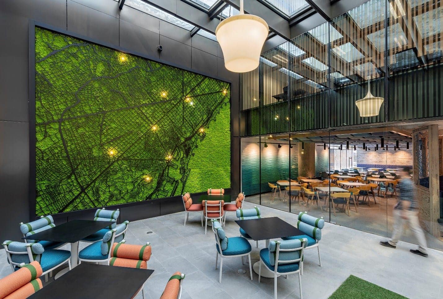
Confidential Client, Barcelona. Photography © Jose F. Parreño.
Although essential for wayfinding, maps and city grids are often arresting design features. As design elements they can reinforce culture, strengthen sense of place, celebrate success, elicit interaction, and enhance aesthetics. Here are a few of our favorites.

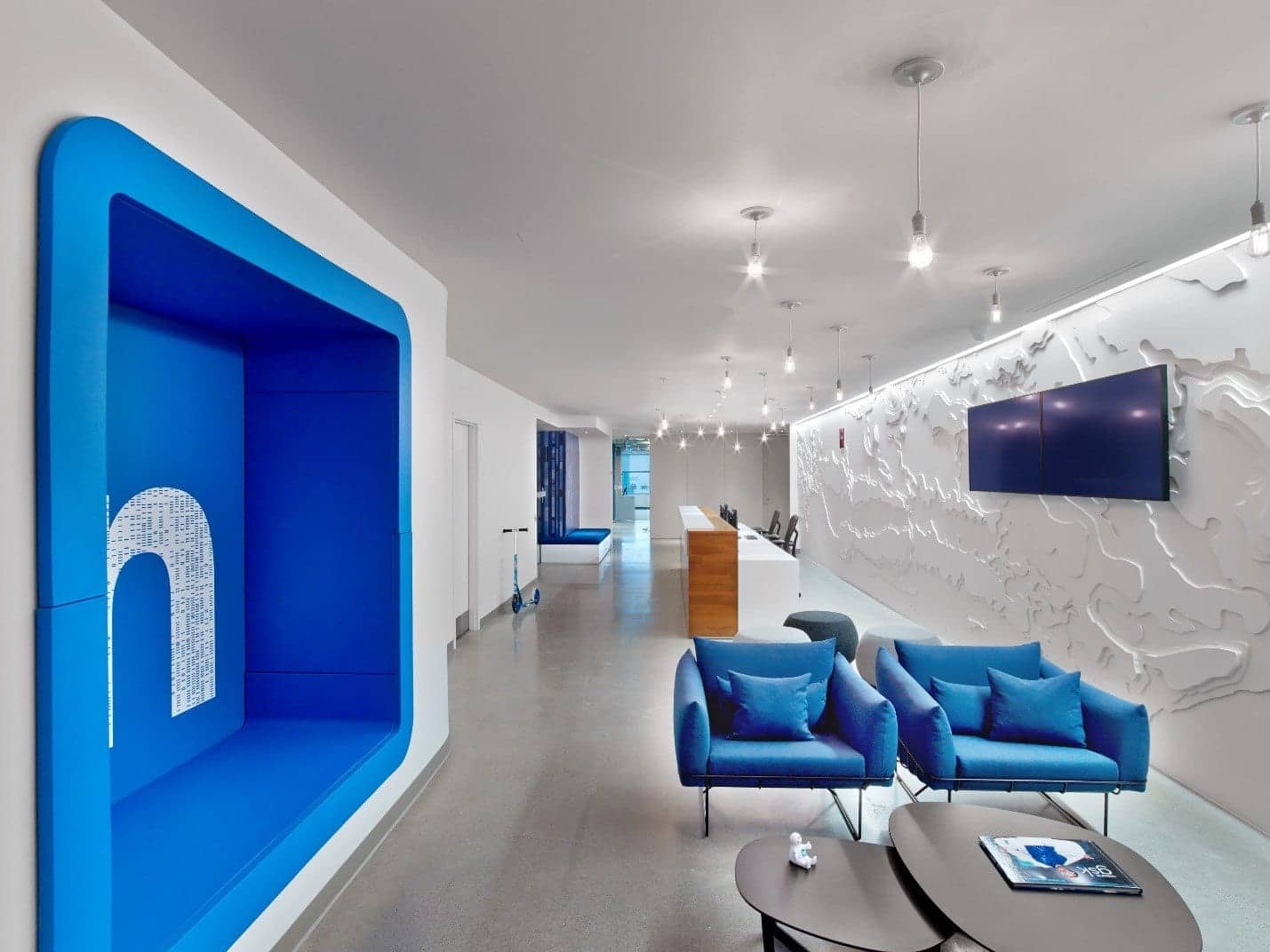
A white on white topographic map of Toronto adds texture and interest. LinkedIn, Toronto. Photography © Eric Laignel.

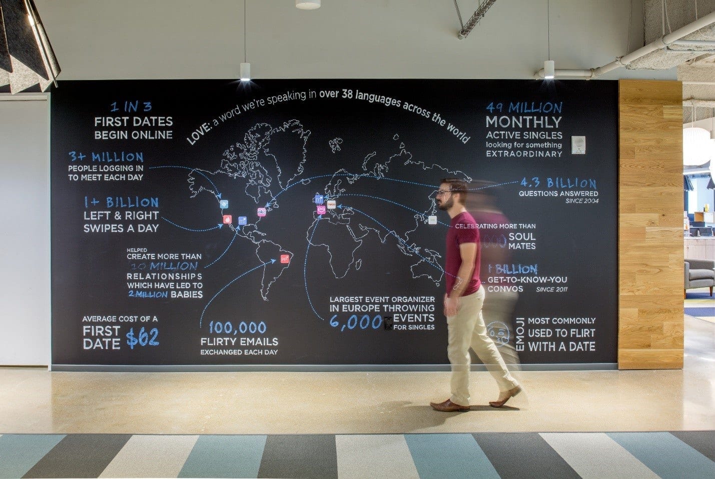
With fun facts and statistics, Match celebrates global success. Match Headquarters, Dallas, Texas. Photography © Thomas McConnell.

A moss background with a lit city grid speaks to place and biophilia. Photography © Jose F. Parreño. Confidential Client, Barcelona.

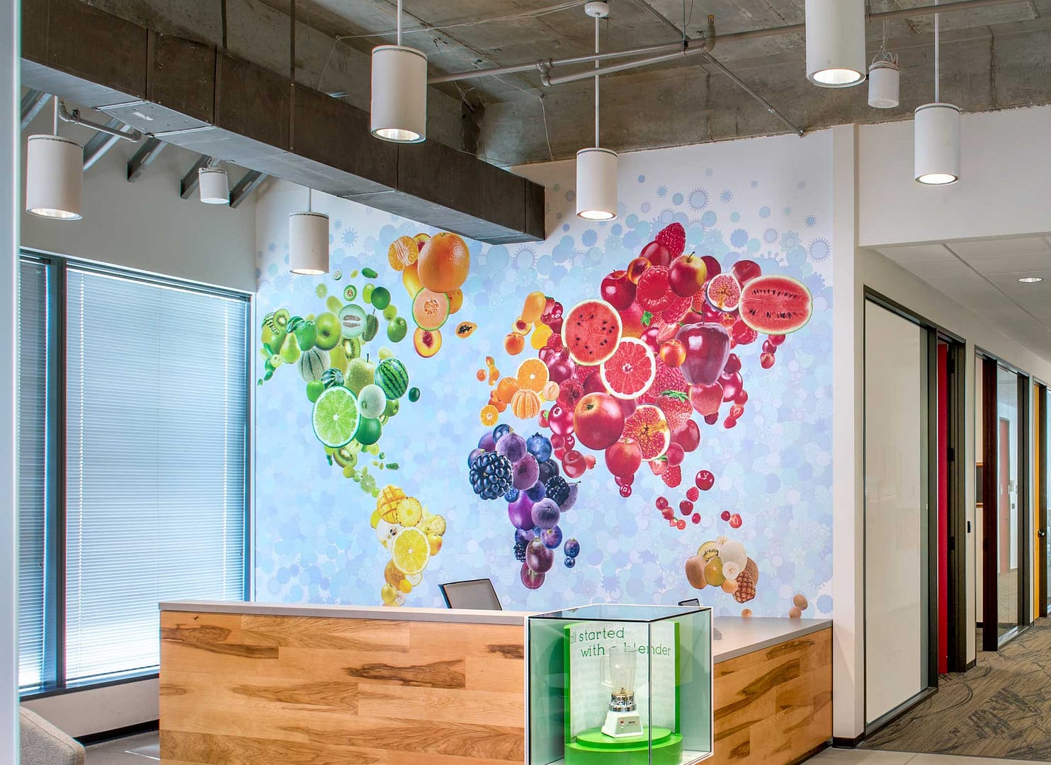
The Jamba Juice appeal is global with over 868 locations around the world. Jamba Juice Headquarters, Frisco, Texas. Photography © Thomas McConnell.

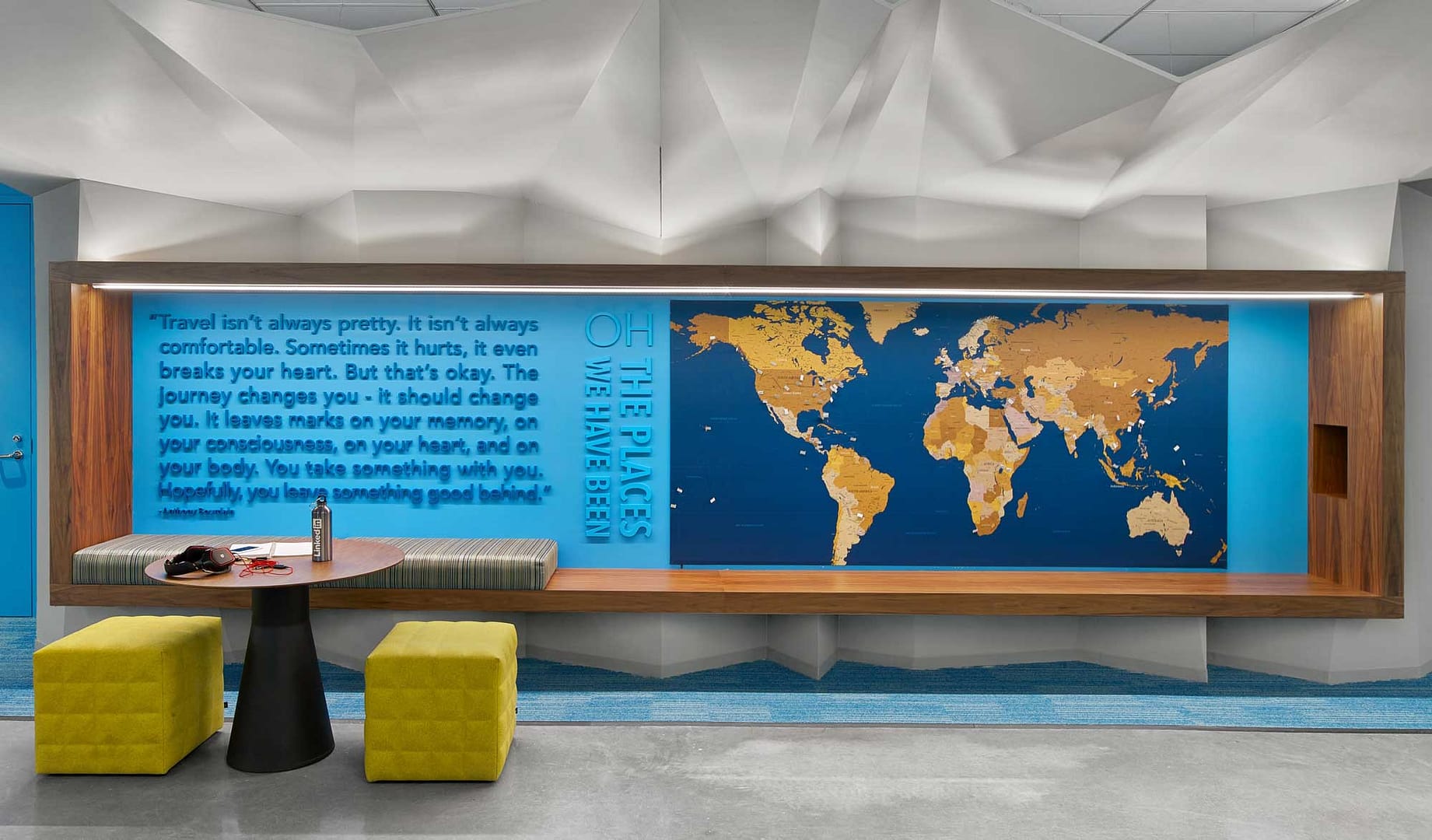
Join with colleagues; mark the destination of a recent journey. LinkedIn, San Francisco. Photography © Eric Laignel.

A grid of the city anticipates arrival. Tresata, Charlotte, NC. Photography © Monica Slaney.

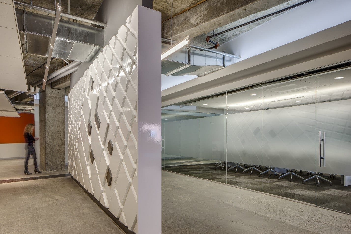
Enlarged and abstract, location becomes a design element. Kilroy Realty, San Francisco. Photography © Sherman Takata.

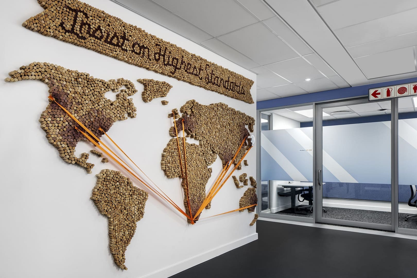
Corks serve as a playful map material identifying points of connection at this Cape Town tech office. Confidential Client, Cape Town, South Africa. Photography © Adam Letch.
