More...
IA's Diane Rogers, AIA, LEED AP ID+C, WELL AP, shares the principles of design that acknowledge, and ultimately deepen, our connections with nature.
Biophilia is a vast topic as old as the Ancient Greek civilization. In modern civilization, interest in topic has been piqued by Edward O. Wilson’s seminal volume on the topic, and formalized with the introduction of the WELL Building Standard. While studying for my WELL AP exam, I came across a document outlining 14 unique patterns of this area from Terrapin Bright Green. Biophilia is generally defined as our connection to the world of living things, and the following phases help connect those ideas to design details and concepts.
The 14 phases are divided into three categories:
Nature In the Space
1. Visual Connection to Nature
This principle addresses the psychological and physiological importance for humans to view what happens in nature. This helps connect us to the natural environment.
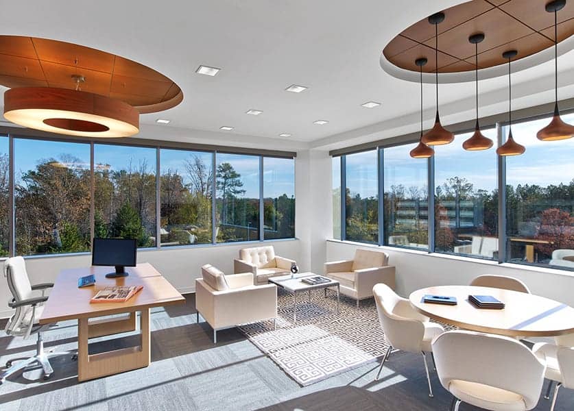
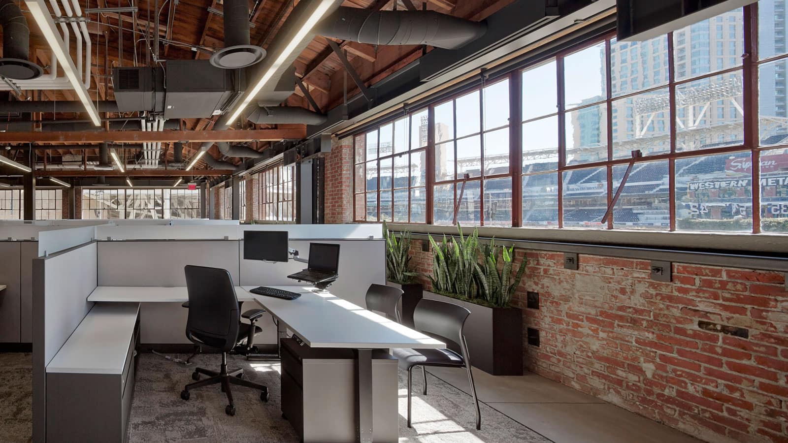
In an office environment, we can address this by locating work areas next to a window.
2. Non-Visual Connection to Nature
In addition to sight, we use all our remaining five senses to to experience space. For interior applications, we pay close attention to textures that link back to nature.
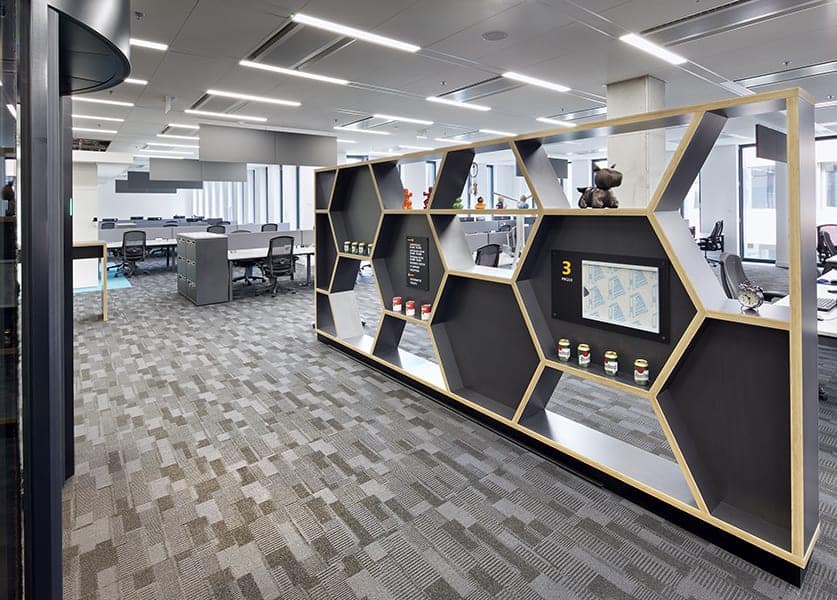
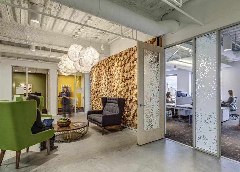
Sometimes, these are applied through using naturally occurring materials, like wood, or programming a space to mirror something we find in nature, like a bee hive or Fibonacci ratio.
3. Non-Rhythmic Sensory Stimuli.
I like to call this the “Campfire Effect;” that movement you see out of the corner of your eye when a candle flickers or leaves rustle. These are the movements we cannot predict, but can analyze later.
Kinetic facades are often a good reference to this principle and, in the workplace, are often realized in interactive environmental graphic design displays.
4. Thermal and Air Flow.
This principle suggests that people want to feel refreshed and invigorated, as though they’re on the top of a mountain. We avoid designing spaces that feel stuffy and oppressive, so we optimize for temperature, humidity, and skin-perceptive air flow. If you’re turning on the heat to get warm, but the air flow is too forceful the breeze will have an adverse effect.
Good air flow can be achieved simply in the workplace by installing operable windows.
5. Presence of Water
It enhances your engagement in the space, if you can see, hear, and–especially–touch water. Moving water creates negative ionization, which is a mild physiological stimulant. This is why standing at the base of a water fall and wave breaks on a shoreline are so appealing. In interiors, touch is more difficult to achieve to due to safety concerns, but the mere potential to get your hands wet can be positive.
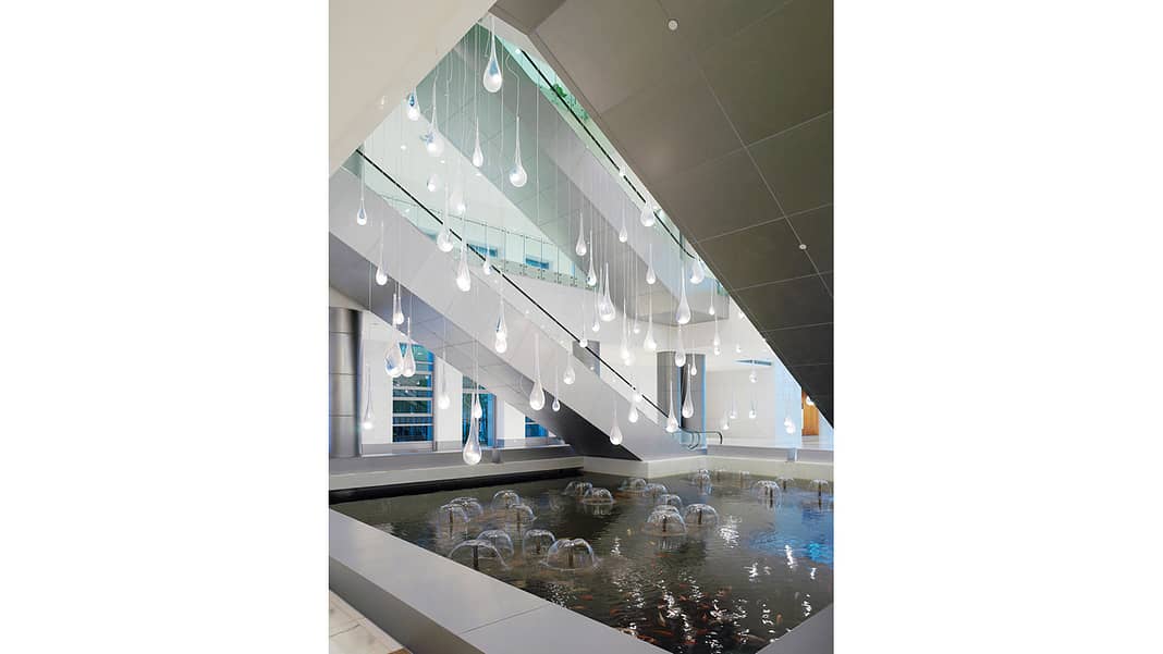
In the office, we often see this embodied in water features, such as in a lobby or shared break area.
6. Dynamic and Diffuse Light.
This tenet reinforces our connection to the natural rhythms of daylight, which changes in hue and intensity. We’ve evolved over millennia to recognize the time-of-day based on color and intensity of light, so it is very meaningful stimuli. Diffusing that light is very important because glaring spaces are uncomfortable, causing people to leave them.
In the office, we achieve this by maximizing access to skylights, atria, and windows.
7. Connection with Natural Systems.
This joins people to the seasons, and the changes that occur during natural life cycles. I like the idea of rooftop gardens, to bring this in, and incorporating exterior materials that develop a natural patina over time.
Specifying native plantings on an office campus—those that grow and die with the seasons—can help make that connection.
Natural Analogs and Patterns
8. Biomorphic Forms and Patterns
These often appear as fractals, or naturally-occurring shapes and schemes.
We can apply this to textiles, custom patterning, and floor plans that are more organic, “blobular,” and don’t appear to be ordered into straight lines.
9. Material Connection with Nature
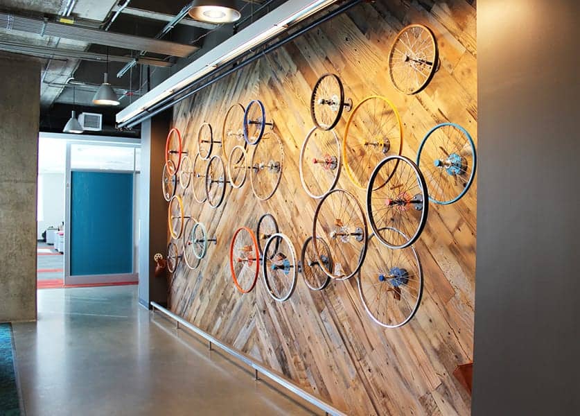
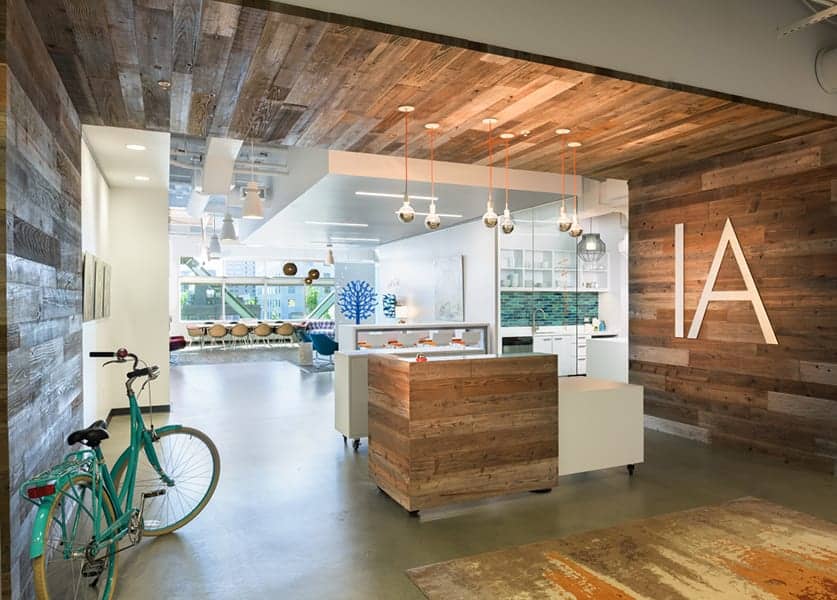
We try to use natural materials that are local, and show off regional geology or something that reflects the native ecology. In Hawaii, for example we used koa wood in a project, as that specie of acacia wood only grows in the 50th state.
In Portland, our IA office features locally-sourced fence boards that hearken the “Stump Town” days.
10. Complexity and Order
Here, we’re referring to a hierarchy through space and scale that goes back to the naturally occurring variety in plants and geographic. As interior architects, we do this through varied application of scales.
For example, exposing the infrastructure of a space gives occupants a better understanding of a shell versus an interior.
Nature of the Space
11. Prospect
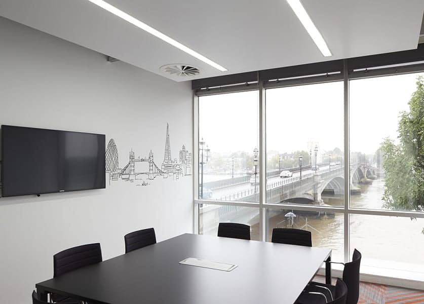
This incorporates views over long distances, which ties back to the anthropological theory of survival in the African Savanna, where humans would gather on a tree line and check the veldt for danger. Like looking across the plain for water, trees, and absence of predators, Prospect gives a big-picture understanding of your environment.
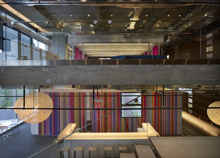
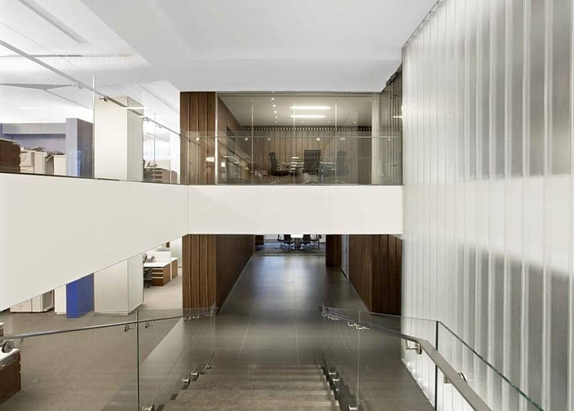
You can look at design over the years and see how often we do this: Balconies, open floor plans, mezzanines, and transparent materials all aim to provide unimpeded views.
12. Refuge
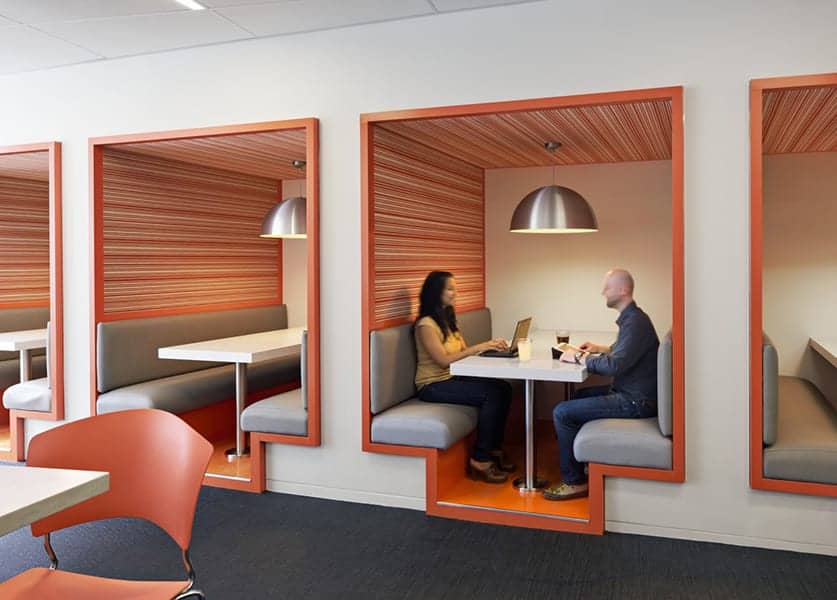
This idea is similar to Prospect in the sense that you can look out, but it also includes a protected position. It requires cover overhead, cover behind to minimize surprises, and having a sense that you’re out of the path of travel. It gives occupants in the space the ability to tune out stimuli, while still maintain a view of the world around them.
If you’re in a cafeteria, and you see a booth with a lower ceiling, you’re in a cozy spot with privacy, as well as a full view.
13. Mystery
This is one of my favorites because it’s something to which we respond strongly. The idea is that there is more to come in a space, which draws you in and engages you with the environment. There are also measures of how far that curve should be. At 20 feet we feel startled and uncomfortable with that kind of bend and 100 feet is too far; we don’t feel the need to engage at that unachievable distance. The sweet spot between those two is that field of anticipation and, as a species, we can have very pleasurable responses to anticipation.
Ie. A lobby with some kind of space that’s behind the visitors space, like a screen or room divider, is a good example of that. You don’t see all that’s there from the entry point.
14. Risk and Peril
If you have a sense of risk that is identifiable but also has a trusted safe guard, most people are willing to allow that thrill of danger. Similar to a roller coaster ride, we know we’re safe but the chemistry in our brain still gives us that rush.
This can be advantageous in work environments: In short doses, a little dopamine makes you feel more alert and more engaged. Glass railings, cantilevers, and stepping stones in a pool of water have a little risk to them that is manageable.

