By Kristi Buchler, AIA | Senior Project Designer

Anduril, Costa Mesa, CA | Photography © Garrett Rowland
For its new headquarters, Anduril Industries, Inc, a defense technology company known for leading-edge products and a mission-oriented culture, has repurposed The Press, a five-building campus in Costa Mesa, CA, once the newsroom and printing plant of the LA Times. The variety and complexity of the multi-building campus in construction type, age, and detailing–each building designed and constructed at a different time during the Times' 46-year occupancy–presented multiple challenges the design team creatively turned to advantage. Collaborating with Anduril since the 2018-2019 design of its former headquarters in Irvine, and at its Washington, DC and Atlanta locations, IA’s design of the new HQ, planned for 1,500 employees, reflects the company’s mission, culture, and continued growth.

Anduril, Costa Mesa, CA | Photography © Garrett Rowland
Connecting the Campus Outdoors and Indoors
The campus envelope was essentially set prior to IA’s engagement. To enhance the complex for an envisioned multi-tenant occupancy, the property developer added factory-style windows in line with the site’s industrial history, an expansive grid of skylights, and an impressive courtyard carved into the center of the main building, as well as extensive landscaping and walking paths to provide wellness opportunities. These improvements perfectly complement Anduril’s belief in the benefits of access to natural light and outdoor activity. They are a draw to living and working in Southern California and support the company’s active culture and community that often bikes to work and walks the campus. By leasing the entire property, the full complex could be connected and explored.
Though some of the buildings were physically linked, others were separated by a narrow alley or thick walls. The IA team connected the structures, creating openings and adding doors and ramps to accommodate differing slab heights, providing a sense of cohesion and easy circulation without the necessity to go in and out of buildings to reach destinations.
However, the design continues to encourage outdoor circulation, blurring the line between interior and exterior, bringing nature in, and taking interior elements outdoors to celebrate the pathways, fresh air, and mild climate. Building terraces complement the many exterior patios. Outdoors, ground-level seating is plentiful, positioned and configured by the design team to create alfresco venues for respite, work, or collaboration.

Anduril, Costa Mesa, CA | Photography © Garrett Rowland
Reimagining the Interiors
A primary goal was to celebrate the site’s industrial heritage while keeping the design clean and modern. In the central hall, for example, the design inserts low-built volumes that allow the full height of the space to be experienced. And to keep the area as open as possible, complex mechanical systems were coordinated and ducts organized, their original metal finish maintained for an industrial look. Existing concrete walls were cleaned and painted a subtle unifying color, with existing deck and overhead structures left raw. At some buildings, the team added a stair or mezzanine, taking advantage of the structural height. For the largest building, small mezzanines originally used as machinery platforms are transformed into conference spaces nicknamed treehouse and crow’s nest.

The Visitor Experience
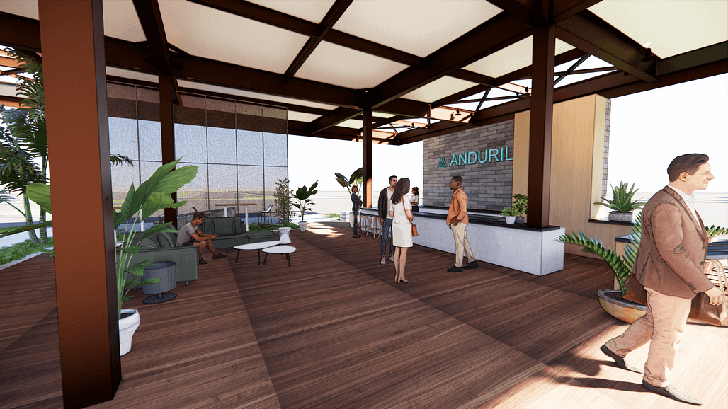
The gas station that fueled Times’ delivery trucks is now the campus entry point. With pumps removed, the awning structure renovated, and millwork, furniture, and lighting added, it is the welcome center for guests and a meeting place for employees going from one building to another.
At the interiors, the design plays on the inherent drama of compression and expansion, the consequence of volumetric change throughout the site. This establishes a sense of anticipation and a touch of awe, particularly felt during the client and visitor journey at the main building. Guests, often high-level government and military officials as well as investors and recruits, are guided from the point of entry through the central courtyard into the reception-showroom-boardroom sequence with its 50-foot ceiling height.

Anduril, Costa Mesa, CA | Photography © Garrett Rowland
This space includes an impressive display of Anduril products on the showroom floor and mounted on the ceiling. Leaning into IA’s retail expertise, lighting was intentionally designed with display in mind and does not interfere with hanging product; special display lights can be moved and change color to accommodate product arrangement. The boardroom floating above the showroom creates a dramatic effect with glass that changes from clear to opaque for privacy simply by pressing a switch.
The design combines drama and the reality of security with an air of mission control as a true reflection of Anduril’s advanced technology. Moving through a darkened vestibule where mobile devices are checked, guests enter a large conference room with an over-sized inlaid table, immense video screen, and a banquette lining one wall. A futuristic lighting design at the ceiling can change to any color. When a meeting is deemed significantly confidential, running lights along the base of the table and banquette turn red, and a sign stating meeting in progress activates.

Anduril, Costa Mesa, CA | Photography © Garrett Rowland
Design Language and Program
Throughout the site, a comprehensive palette of warm neutral tones punctuated by the use of colors found in nature—blue, green, and a targeted use of red—are components of the overall design language that supports a universal program developed to flex and adapt for different building structures, workplace functions, and the varied assignment of teams to different neighborhoods. Future growth and flexibility were top-of-mind. With a seamless flow, the campus accommodates workplace functions of all kinds, including large workstations with tool storage for hands-on innovation and product development.
Contributing to the consistent design vocabulary, a sequence of exterior materials—reclaimed wood planks, metal roofing panels, and troweled concrete—is applied in different ways at the interior of primary entrances to enhance wayfinding. And for ease of recognition across all buildings, neighborhoods are primarily blue or green, medium-sized conference rooms are red, huddle rooms green, and phone rooms blue.

Anduril, Costa Mesa, CA | Photography © Garrett Rowland
Yet each building is unique, with moments of discovery built into the design. Each of the five buildings is anchored by a hero moment—the floating conference room; a sophisticated, hidden speakeasy; the dining and all-hands venue; and a breakroom filled with light from a skylight-grid atrium. At the oldest building in the complex, the hero moment is the building’s history and architecture, distinguished by a wood structure and timber ceiling in contrast to the industrial feel and metal detailing seen across the campus.
Throughout, integrated lighting emphasizes each building’s architectural and structural language. At one open area, light fixtures strung on tension cables spanning 50 feet are an IA innovation to avoid a plethora of light fixtures suspended from the ceiling. The effect is subtle, the fixtures unobtrusive, and the space well-lit.
Final Thoughts
The minimalistic design—inspired by the open, industrial ambiance of the architecture and clean lines of Anduril products—combined with multiple amenities (including a fitness center in the design phase) and workplace conveniences, as well as the surrounding outdoor area, come together to achieve the company’s vision of a holistic headquarters for productivity and wellbeing, while infusing an iconic property with new life and purpose.

Anduril, Costa Mesa, CA | Photography © Garrett Rowland

Kristi Buchler, AIA
Senior Project Designer
From initial conception to completion, Senior Project Designer Kristi Buchler is responsible for the overall planning and design direction of projects that exceed client goals and aesthetic quality. Her well-known clients represent a significant cross-section of industries. With over ten years of experience, Buchler holds a Bachelor of Arts in Interior Design from the University of Kentucky and a Master of Architecture from Savannah College of Art and Design. She is based in IA’s Los Angeles studio.
